How Data Misrepresentation Can Cost You Thousands (Or More!)
In the grand scheme of things, most of our jobs surround a simple premise. We make choices & decisions based on how we interpret the data at our disposal. If something were to happen to the validity of our data, then the outcome of our decision-making would be affected accordingly.
More correct data = better outcomes.
More flawed data = worse outcomes.
It is with this assumption that we begin our journey into the real dangers of data misrepresentation.
Graphical Misrepresentation of Data
One of the easiest ways to make sense of large data sets is with a visual aid. These visual aids include things like graphs and charts. While helpful for reporting, visual representations of data can be very misleading if used improperly.
Let’s take a look at how some simple formatting changes can completely skew the takeaways of a visual aid.
Below I’ve created an example using the number of “leads” generated over the course of 10 weeks. NOTE: Assume week 8 is simply an anomaly. There were no extra marketing efforts made, just one great, random, week.
| Leads Generated | |
|---|---|
| Week 1 | 20 |
| Week 2 | 20 |
| Week 3 | 30 |
| Week 4 | 10 |
| Week 5 | 10 |
| Week 6 | 10 |
| Week 7 | 10 |
| Week 8 | 80 |
| Week 9 | 10 |
| Week 10 | 10 |
I’ve then taken this data and created 2 very different graphical representations to illustrate how formatting can be manipulated to create a large misrepresentation of data.
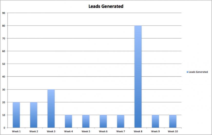
This is a bar graph showing the number of leads generated per week:

Logically, this tells us that after a decent showing in weeks 1-3, excluding an abnormal week 8, we’ve seen a downtrend in leads generated from 20-30 leads / week to 10.
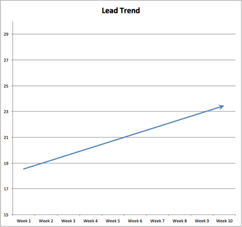
Below we’ve illustrated the exact same data set using different formatting:

Here we’re looking at a linear trend line of the above data. You’ll notice that the actual data line has been removed and the Y-Axis has been limited to show the maximum “growth” of our trend.
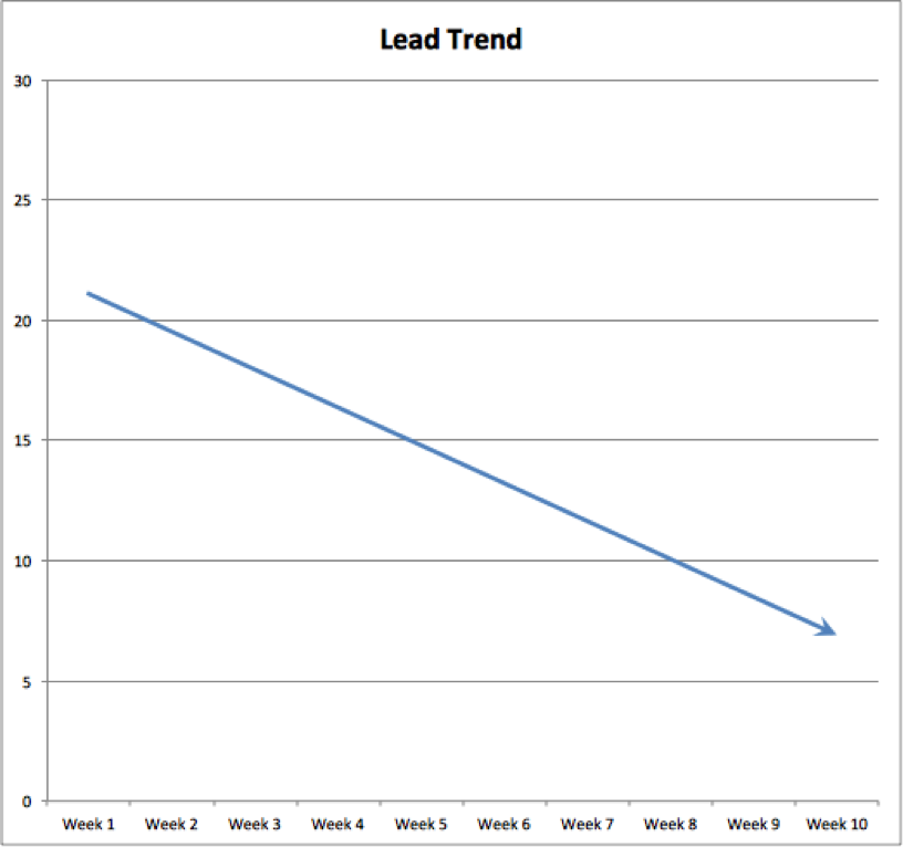
Because of our abnormal week 8, we’re seeing an “upward trend”. If we were to assume week 8 performed as weeks 4-10 did (10 leads).. this is what we would see:

This depicts a very, very different story showing a speedy downward trend. By just manipulating a couple formatting options in excel, we’re able to misrepresent data in polar opposite fashion.
When basing decisions on reported data, make sure you have access to the raw data as well. That way, if you suspect something is off then you can check the validity of the graphs/charts yourself.
How All This Fraudulent Data Affects You
Data just like what’s illustrated above, is used for dozens upon dozens of decisions, reports, analysis & planning. Some common examples include:
- Advertising Budget Allocation
- Stock Investment Decisions
- Revenue Projections
- Profit Margin Analysis
Imagine the implications of making major, business decisions based on misrepresented data & statistics. It could mean as little as reporting a few extra website hits / month to as major as investing all your company assets into the wrong venture.
When reading a report or analyzing charts & graphs, make sure you know what is is you’re looking at. Ask yourself these questions:
- How is the graph scaled?
- Should this be how I’m looking at the data?
- How would I show this data? Am I viewing it the same way?
- Where is the raw data to back it up?
Just a few simple quality assurance, self-check questions could make the difference between prosperity and plunder. Be careful, be cautious, ask questions and always double check your data, as it could make all the difference in the world.
Most newsletters suck...
So while we technically have to call this a daily newsletter so people know what it is, it's anything but.
You won't find any 'industry standards' or 'guru best practices' here - only the real stuff that actually moves the needle.


