Website navigation best practices that sell: an insider’s guide
Website navigation best practices. It’s the most important piece in helping your visitors find their way around your website.
And it’s not just there to help them find their way around. If you lay it outright, you can also lead them around –which is exactly why you should be focusing on making your navigation flawless.
We’re going to share with you the best B2B website navigation best practices to create the best navigation known to mankind for your site.
Your Website Is Like A Brick and Mortar Store
When you go into any decent brick and mortar store, you’ll be guided by signs at the end of every aisle that display the contents of each aisle.
Without such a system, the store would be complete chaos.
Your website is no different.
If stores didn’t have signs at the end of every aisle, customers would have to rely on sales clerks to help them find what they need. And we all know how hard it can be to find a sales clerk. Even if you can find them, they can’t possibly help hundreds of people find their way around the store efficiently.
Customers would quickly give up and leave the store if they were forced to go aisle by aisle looking for items they need with no signs to guide them.
And that’s what you’re doing on your website if your navigation is poor: leaving.
If you create a flawless, streamlined navigation system, you’re more likely to retain visitors and able to effectively hold their hand through the customer journey and lead them to where you want them to go.
So how do you do that? It starts with understanding fundamental strategies to optimize conversion rate and applying them to your navigation…
Choose the Right Navigation Buttons
B2B website best practices for user experience begins with navigation buttons.
Actually, you might not be the most qualified person to choose the buttons for your navigation menu. It might be best to get some help from your visitors.
Go to Google Analytics and find out which pages your visitors are deeming most important. Follow completed transactions and find out which series of pages your visitors went through that got them completely through the funnel.
Whenever you see a trend, add these pages to your navigation menu.
Look through heat maps to see which navigation buttons get clicked on the most.
Ask. Yes, actually ask them in a slide-in survey, “What do you need in the navigation to better help you find what you need?”
Hierarchy and Organization
Effective site hierarchy is key to UX navigation best practices.
It seems simple. But many mess this up.
We’ve seen sites jam pack the navigation menu with so much information it was difficult to find your way around. You almost needed a navigation menu just to be able to navigate their navigation menu.
Make sure that you are creating submenus within your menu to help guide people further than just the top level.
When you add submenus, make sure that they are organized effectively. First, make sure that they are under the most appropriate top-level button. (Really. We see websites mess this up repeatedly.)
Then, make sure that each secondary button is placed in order of importance. If it’s a page that a lot of visitors go to – put it higher on the menu so it can be found quicker.
If a lot of your visitors are looking for your Contact page, don’t bury it so far down that it takes forever to find it. And don’t put your Privacy Policy at the top if visitors aren’t reading it.
The Laws of Primacy and Recency
There are two important laws of website navigation best practices that you need to keep in mind when it comes to placement of navigation buttons: the laws of primacy and recency.
These laws state that our brains tend to remember most the first items and last items presented to us.
Therefore, make sure your most important buttons are placed at the beginning and at the end of your menu bar. Place less important buttons in the middle.
This is probably why you typically see a Contact button as the very last button on most sites. It’s also what visitors have come to expect. So I’d suggest placing it there.
The Secret Power of Button Text
The goal of button text is to keep it crystal clear as to where the button leads. But it’s also a good idea to try to make the button text engaging when you can.
If your business website is more like a table of contents for what you have to offer, text such as “Products”, “Services”, or “Portfolio” typically works here.
Or, if you’re an institution such as a school and you need to help people pre-select who they are, buttons such as “Students”, “Teachers”, and “Alumni” are useful in guiding them to the right place.
If you’re in an industry such as banking and it works to use text in the form of verbs – then do so with text such as “Invest” or “Get a Loan”.
Buttons such as “New here?” are a good way to help someone who might feel lost on your site. It’s a way to engage them quickly and show them where to start rather than just leave it up to them to find their way around.
I recently saw a button that said “Explore Features”, which is more exciting than just saying “See Features.”
Common Navigational Issues That Can Reduce User Experience
While navigation is your primary tool for helping visitors get around your site, there are navigation issues that can impair the customer journey.
Hover menus have been popular over the last few years. These are large menus that open up and take up a big portion of the screen.
They warrant the space they occupy and point attention to what’s inside the menu, which is good because the info inside is important.
The problem lies with the fact that the hover functionality can screw navigation and user experience up.
Take a look at the screenshots below to see how a hover menu works.
When a visitor clicks on a top-level button, such as “Travel”, their natural UX navigation pattern for their cursor is to go directly to the next level button that they are interested in. In this case “Flights”.

But this direct mouse movement doesn’t work with a hover menu. Because, as you can see, the cursor slips outside of the gray hover menu window.
The mouse movement must stay within the hover menu window, as in the screenshot below, or the menu window will close. It will then open the “Sports” menu because the mouse has slipped over it.
It makes for an annoying B2C or B2B user experience.

Who naturally moves their mouse like this?
And what if visitors didn’t see that they opened up a different menu window and leave in frustration? Or what if they get tired of the extra hassle and leave your site?
There’s also the issue of the hamburger menu, the 3 line icon below that you see everywhere nowadays that’s supposed to tell your visitors that it opens up a menu bar.

But what if your visitors don’t know that it opens up a menu?
As far as mobile website navigation best practices are concerned, if you’re going to use this icon to save space on a mobile screen, at least add the word “Menu”. Or just use the word “Menu” on its own. Doing so in both cases has shown to increase click conversions.
So those are a couple of ways that navigation can be hurt. Here are a few tips to create the best website navigation experience possible…
Best Practices for Website Navigation
There are three major parts of web navigation best practices:
Fixed Navigation Menu
Most websites offer a main global navigation menu bar at the top of their pages that disappears when you scroll down the page.
But then, there are those main navigation menus that stay with you and are always visible at the top of the page.
This is an effective way to always keep the navigation menu bar in plain view.
Floating Arrows
Ever land on a page that looks like all of its content is right there? But really, there’s more content below?
There is no guarantee that visitors will ever scroll down the page. In fact, heat maps show that many don’t and leave.
Floating arrows are an effective way to inform your visitors that there is more below the fold and entice them to scroll down.

A Uniform Navigation Menu
Make sure that your navigation menu is the same on every page or your visitors will become lost and confused.
Nothing gets me more excited than when I go to a grocery store or big box retailer and the store is set up exactly the same as the last one I was at in another town.
It’s pure genius because customers remember that the next time they have to go to a new store, they know what to expert. They know that they will find what they need because the store will be a duplicate of every other one. Think Walmart, Target, McDonald’s, Chick-Fil-A, or The Gap.
Do the same with your navigation menu. Users on the internet are already programmed to expect a standard structure with navigation menus.
Optimize Within the Navigation Menu
Continue to help guide visitors within the navigation menu.
A lot of websites offer a list of product names that will be of absolutely no use to visitors since it isn’t clear what it is or why you would need it.
So preface your products with the benefit. In other words, create your navigation menu based on benefits, not product names that bear no meaning.
Create differentiation between categories and individual products with font color changes so that visitors’ eyes will be able to properly sort through and organize the information with ease.
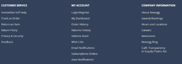
The footer menu below makes the category headings bold, which is great. But it’s still a barrage of white text which makes it hard to differentiate all of the info and sort through it.

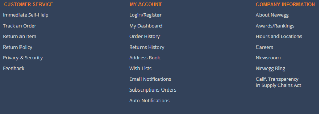
Look at how much easier it feels to sort through the information with a simple color change at the top level heading category:

The eye automatically sorts through the top level orange text. It makes it easy to identify the top level category of what you’re looking for – and then quickly sort through the column of text –- much better than feeling bombarded with all that white text.
Don’t ever think that you can’t optimize your menu bar even further to make user experience more effective. Every small opportunity can add up to a big difference in the end.
Conclusion
So those are the best B2B website navigation practices for a kick-ass navigation menu that maximizes click-throughs and optimizes user experience.
Hopefully, these tips will get more of your visitors all the way to the end of your funnel.
Your navigation menu plays a vital part in website sales. It’s worth your time and focus. Afterall, it is the central hub for helping your visitors navigate your website.
Need more help? We offer UX website design services that will reduce user frustration, increase retention, and improve conversion rates. Check us out.
What’s your biggest struggle with user experience and/or navigation menus? Let us know in the comments and we’ll try to help out for free.
Read about Why your B2B conversion rates suck
View all posts filed under “UX & Website Design”
Most newsletters suck...
So while we technically have to call this a daily newsletter so people know what it is, it's anything but.
You won't find any 'industry standards' or 'guru best practices' here - only the real stuff that actually moves the needle.


