
Above The Fold Award: The 33 Best Online Agency Websites of 2016

Hi-tech. Low tech. Swish. Sleek. Creative. Fun. What makes a good website? What makes you stop and take notice?
We asked our team these same questions. And from our team’s discussion, the Above The Fold Award sprung into existence.
Who Won The Above The Fold Award
To make our cut, websites had to be well designed, user-friendly, feature good content, have exceptional technical configurations, and be customer-centric (because let’s not forget they have a job to do). They had to score highly in each of these categories just to be considered, and then they had to withstand a little statistical modeling and a lot of subjective judging before they found their place on the ladder.
Now, our definition of online marketing agency was a little broad (we opted for any company that provides at least one marketing service), because we wanted to throw the doors open and acknowledge some real trendsetter websites. And at the end of the day, this was a fun exercise for our team; an excuse to get together and debate about what makes a website great.
So, without any further ado, here are the 33 agencies with something to say on web design best practices.
#33 Agency Website: Victors and Spoils
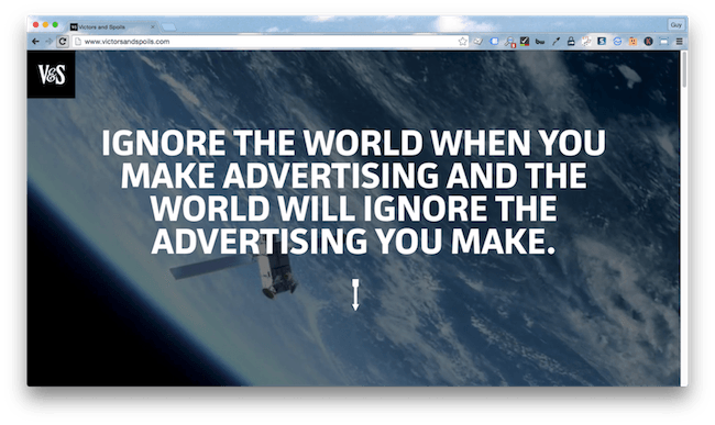
About Victor and Spoils
Victor and Spoils is a full-service advertising agency.
Something a bit quirky
These guys are careful to position themselves apart from competitors and do a great job of highlighting their value proposition (they rely on freelancers as well as an in-house team). Scroll over the team images and you’ll get a real feel for the individuals behind the brand.
Tres chic
It didn’t revamp the traditional website structure (top header, multi page etc) quite as well as competitors like TVGla, but the V&S site is still a great example of how to add a contemporary feel to pretty standard architecture.
Technically great
Mobile-friendly and fast out the start gate, V&S ticked the boxes on the technical front for everyone but PageSpeed, which wasn’t too keen on some of the bigger graphics files. With a page load time of just under two seconds, we still felt they deserved some serious technical kudos.
Room for improvement?
Customer focus
It might look the part, but this site dropped marks for customer-centricity. No real thought has been given to the journey to purchase – the site is only geared up to introduce individuals and an (albeit impressive) back catalogue of work. Plus the copy on the homepage is a bit clunky, and there’s a real lack of analytics and tracking tools compared to some of our other winners.
What can we learn?
Websites have a part to play
OK, OK, I know I’ve said this before, but it bears repeating. When it comes to lead generation, your website is your greatest asset; using it as a glorified calling card is a waste of time, money, and hosting space.
#32 Agency Website: 23Red
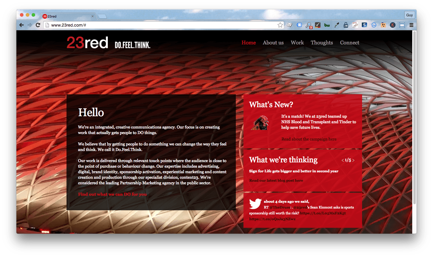
About 23 Red
Communications agency 23Red deliver services in advertising, branding, digital, and experiential marketing.
Less is more
23Red scored highly in the content category. Their bold, red (but you guessed that, right?) site features minimal content designed to create maximum impact. They’re showcasing what they do, and they do it very well.
Appearances matter
Optimized for mobile devices featuring Apple platforms, the team at 23Red have taken care to ensure their site looks good, whatever size screen you’re surfing on.
Know where you’re going?
Ease of navigating was a critical factor in the usability round. With its standard structure, uncluttered menu and a meager 10 pages, navigating the 23Red site is as easy as, well… 2,3.
Room for improvement?
Let’s prioritize efficiency
23Red dropped marks for usability, and it was down to one thing. The blog. Short, snappy posts fit with the streamlined look of the site, but they are displayed in a feed that makes accessing older posts a challenge. Users will struggle to find information about specific projects unless they know the name of the account manager (you can search by contributor). There’s also a category search, but with ambiguous names like ‘Great good’ and ‘Ideas’, it’ll take a fair bit of clicking to land on something specific.
What can we learn?
Make a lasting first impression
Given that red has connotations of anger, fire, and blood, it’s a brave choice for a color scheme. But after days of trawling through blue sites, it was a welcome change and definitely stuck in my mind.
#31 Agency Website: Bluetext
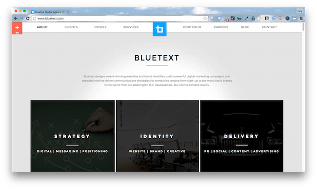
About Bluetext
A brand-focused marketing agency that delivers innovative approaches to corporate branding.
Winning design
With a sleek homepage you can flick quickly through, an abundance of social credibility, and copy in all the right places, Bluetext scored big in both the design and content categories.
Give them what they want
You won’t hold an audience if you don’t know what they’re looking for. Running a host of tracking and analytics platforms — HubSpot, Datalogix, Pingdom, etc. — supplies Bluetext with the metrics to meet everyone’s needs.
Mobile friendly
Responsive and optimized for mobile devices, you can experience this flashy site in glorious technicolor on any sized screen.
Room for improvement?
Too much of a good thing
There’s a (long, long) list of clients right below the fold of the homepage. While lending credibility, the overly-long list also encourages users to speed up their scroll, taking them straight past another similarly-styled list of their portfolio work. And that portfolio work is what you really want prospects seeing.
What can we learn?
Credibility is (almost) always a good thing
Loudly and proudly displaying previous work and clients can go a long way towards establishing credibility. Bluetext did a great job showing that off (even if it was a bit too much for our taste).
#30 Agency Website: BBDO
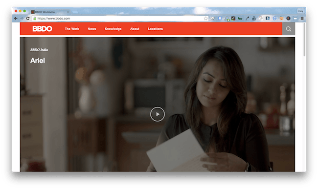
About BBDO
BBDO is a full-service, international advertising agency.
Quite the showcase
You might not have heard of BBDO before, but most people will recognize at least one advert on their homepage.
Full marks to the techs
A high scorer in the technical category, the BBDO site is optimized for mobile, seriously quick, and scales to accommodate different size screens.
Heading in the right direction
With a nice simple top menu, clear headings, and a meager five pages, navigating the BBDO site couldn’t be simpler.
Room for improvement?
Guess what they do
No seriously, guess. Because you’ll have to intimate from the various awards and showcased work exactly what services BBDO provide – it’s not going to waste space spelling it out for you.
What can we learn?
A name isn’t everything
With an international reputation and big name brands on the client list, BBDO might not need a site that’s focused on lead generation, but to us it seems like a missed opportunity not to include some information for top level funnels.
#29 Agency Website: Fishbowl
About Fishbowl
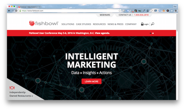
Restaurant data experts Fishbowl provide a host of solutions to help organizations analyze data and make profitable decisions.
Easy to navigate
With a simple homepage and a well-organized menu, the Fishbowl website makes tracking down information a breeze.
Responsive design
We particularly liked the clarity of the homepage. Engaging and communicating without being overwhelming, it helped Fishbowl achieve a good score in the content category.
Fast as lightning
Quick load time? Check. Light on data? Check. Easy to navigate on a smartphone screen? Check and check!
Room for improvement
Lead me to your promised land
Fishbowl’s site would benefit from clearer expectations — pricing, turnaround time for contact form submissions, etc. And for an agency focused on data, it was surprising to see how few analytics and tracking platforms were at play.
What can we learn?
Old school creative works
You don’t need to break the rules to be creative. Fishbowl’s mix of imagery, clearly-written copy, and conventional design are user-friendly without being inhibitive.
#28 Agency Website: Spindle
About Spindle
A self-confessed ‘shack full of nerds’, Spindle are the makers of HelloLily, a platform that transforms contact information into business intelligence.
Personality is key
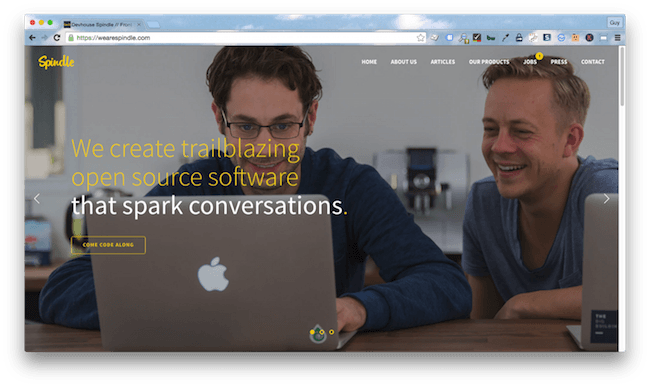
Spindle are a good example of the importance of brand personality. The agency has a distinct voice, isn’t afraid to use humor, and has created an engaging personality that helps set them apart from competitors.
A picture speaks a thousand words
One of the biggest scorers in the design category, Spindle shows us how to use media to great effect. The pictures on the homepage are original and speak to the personality of the brand while the introductory video on ‘About us’ ticks every box and then some.
Playing to strengths
It would be a bit disappointing if the nerds couldn’t score well in the technical category. Luckily the Spindle team deliver with HTTPS, lightning fast load times and a responsive, mobile-friendly design.
Room for improvement?
A bit of selling wouldn’t go amiss
These guys aren’t salesmen, and it shows. CTA are non-existent, the most in depth information available about each product is a link to the code (it’s open source), and there’s no real thought gone into the journey to convert visitors into product users and evangelists.
What can we learn?
Even cool websites need a purpose
At the moment, the Spindle website is more of a half-baked handshake than a lead generation or engagement system. Which is a shame, because it was nice to see a different shade of blue for a change.
#27 Agency Website: Smartling
About Smartling
Smartling’s agile translation engine integrates with e-marketing solutions to deliver content in multiple languages.
Built for mobile
Mobile friendly and able to adapt quickly to any screen, this site works just as well on the go as it does from a desktop. All the content is well spaced, accessible, and easy to navigate, whether you’re surfing on a 4.5 or 30-inch screen.
Valuable content on every page
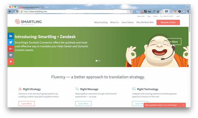
If you are new or innovative, then describing what you do can be a challenge. Smartling hit on the answer with streamlined content that integrates copy and graphics. The content across the site perfectly anticipates questions, delivers answers and holds a user’s focus. In short, it does exactly what it should do, it sells the agency.
Technically on point
Despite its graphic-heavy design and wealth of information, the Smartling site loads quickly and doesn’t gobble data. Both very important when you’re trying to hold the attention of an impatient online audience.
Room for improvement?
The design lacks originality
Multi-media header? Check. Menu bar at the top of the page? Check. Sections divided horizontally? Check. There’s nothing wrong with this site design, it ticks all the boxes, but it does look like half of the themes for sale on ThemeForest. It’s not exactly memorable.
What can we learn?
Dare to be different
If you want fickle audiences to remember your agency over competitors, it pays to stand out.
#26 Agency Website: Somo Global
About Somo Global
Somo Global provide a host of digital marketing services targeted to mobile marketing.
One page wonder
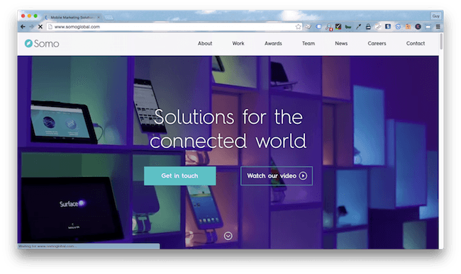
One of the best examples of a one-page site, Somo Global’s balance between information and style saw it score well in the design category.
International appeal
With each of its four offices only a click away, ease of communications is another thing the Somo Global site does well. The clock feature highlighting the local time in each office location is a nice touch.
An easy journey
One of the advantages of a one-page site (this one has another for the team, but it’s basically one page) is the simplicity of use. Somo Global demonstrates how well this feature can guide visitors through the sales process, leaving them completely convinced by the time they hit contact details.
Room for improvement?
More speed, please
Devoid of the heavy media of sites like Panoply and Spindle, Somo Global really ought to be a bit lighter on its feet. With a whopping 13 second load time, impatient visitors can’t be expected to hang around while the site materializes.
What can we learn?
Functional doesn’t have to mean ugly
The best marketing agency websites marry function and design, but shouldn’t overlook performance.
#25 Agency Website: Y7K
About Y7K
A full-service digital marketing agency.
So. Very. Fast
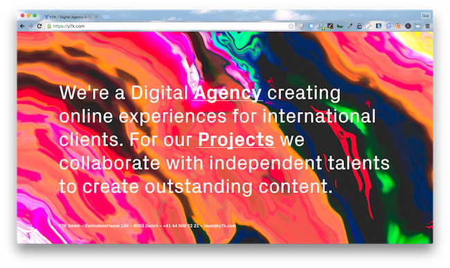
There are a few guys in the shortlist who could learn from Y7K. The site is styled impeccably, full of graphics, animations, and nerdy little touches, but it still loads in less than five seconds, doesn’t gobble data and looks great on a 3-inch screen.
Engagement matters
Running powerful analytics tools, including Google Analytics and GoSquared, allows Y7K to track visitor behavior and engagement, optimizing the site to enhance user experience.
Head turning
One of the big scorers in the design category, this site really is incredibly well styled with some innovative touches (make sure your speakers are on low when you scroll down the team page).
Room for improvement?
I’m not sold
Animated avatars of your team are all well and good guys, but what do you actually do? Sorry, you did tell me… you create ‘digital experiences’. I don’t even know if I need that in my life.
What can we learn?
Style over substance
Flashy websites might look the part, but they’re there to serve a purpose. If you don’t consider the value proposition or journey to purchase when designing them, then they are just a jazzy handshake that can’t hold a conversation.
#24 Agency Website: TVGla
About TVGla
A digital marketing agency providing services in social media, advertising, market research, and more.
A smart layout
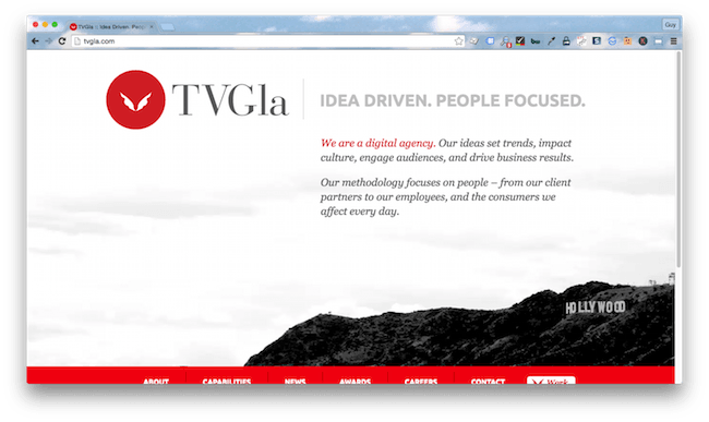
The design of this site is fantastic. The menu placed in the bottom quarter of the page makes overlooking the case studies scrolling beneath it almost impossible. With a few tweaks to the traditional layout, TVGla have taken complete control of the user experience.
Clear and concise content
Carefully chosen images speak to the brand as professional, fun and creative while simple copy and bullet points sell each service. When it comes to engagement, less is more and TVGla nailed it.
A touch of originality
Rather than trying to shoehorn content into an established design, the TVGla team have designed their site around the brand and its services. The result is a website that is functional and simple to use.
Room for improvement?
Mobile is the future
Not that TVGla can cash in on it. The site is missing mobile viewport settings, so that flashy design is a little too compact for mobile and makes clicking the link you want a problem.
What can we learn?
Always double check
The site features tools to optimize performance for mobile but because they haven’t been configured correctly, they are useless. Taking a few seconds to run the URL through Google’s Mobile-Friendly Test would have identified the problem immediately, and it could have been corrected there and then.
#23 Agency Website: Extractable
About Extractable
Technology specialists providing insight and marketing solutions.
Sophisticated site design
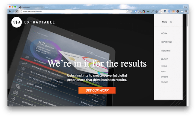
Featuring a sleek design and a couple of innovations (the fold out sub menu is a nice touch), the Extractable website is very grown up. A design that can consolidate this amount of content and still look smart deserves some serious kudos.
Metrics matter
Given how low this site scored in the content category (I’ll get to that in a moment), we were surprised to see it using the engagement analytics platform comScore. Running alongside Google Analytics, this pairing should provide a host of metrics on user behavior, helping Extractable increase conversion rates and ROI.
Responsive
Full points for the Extractable design team, the site function and performance can’t be knocked. It scales easily to fit any screen, loads quickly and works perfectly from a smartphone.
Room for improvement?
Come on guys, content…
The homepage almost had me wondering if I’d landed on Apple by mistake, but the reams of copy soon pointed me in the right direction. This copy-heavy website has a tendency to overwhelm.
What can we learn?
Less is more
Enough said.
Most newsletters suck...
So while we technically have to call this a daily newsletter so people know what it is, it's anything but.
You won't find any 'industry standards' or 'guru best practices' here - only the real stuff that actually moves the needle.
