The anatomy of great B2B SaaS landing pages that convert
Building landing pages for your B2B SaaS (software-as-a-service) product can be a daunting task. While there are plenty of templates and theoretical articles available, swimming through the sea to strike gold can get pretty tedious. In this guide, we’ll show you exactly where to focus your efforts to sell more and worry less with the anatomy of the highest converting SaaS landing pages.
Why trust us? We’ve been in business for 10 years, and we’ve worked with countless companies in the B2B SaaS industry.
For the love of all that is good, don’t use a homepage
Before we get down to the nitty-gritty, though, let’s talk a little about why investing in great SaaS landing pages is so critical. I see one common mistake made innocently by marketers the world over, and that’s sending traffic they’re paying for straight to the homepage.
I call this practice the Bus Driver Method because it’s a lot like dropping people off at the bus stop down the street from their destination and expecting them to find where they’re going. Driving traffic to a homepage instead of a landing page dedicated to the content or offer of your ad is no different. Users get the subtle clue that it’s up to them to find whatever they’re looking for that made them click your ad in the first place and will likely bounce. So unless you’re running a brand awareness campaign and are okay with the genuine possibility of not getting conversions, avoid the Bus Driver Method.
The better approach is to ensure that the messaging between your ad copy and landing page is congruent, which is why the best method is to leverage landing pages tuned to the specific benefits your ad is touting. So if you’re selling a productivity tool, your ads may say something like, “Reduce time spent on TPS reports by up to 58% and never come in on the weekends again.” The resulting landing page that a user is taken to should reinforce that ad copy with something like, “Spend less time reporting and more time relaxing.”
Okay, off the soapbox—onward with the article 🙂
Fundamental SaaS landing page structure
Justin Kalaskey, our resident UX guru and an all-around lovely person, will yell at me for what I’m about to say. He rightly believes that no cookie-cutter landing page will “work” 100% of the time.
That’s true. However, it’s important to remember that this guide is about best practices and highlighting common themes employed by the best SaaS landing pages. Since there’s a lot of overlap in the industry, it’s possible to identify the “line of best fit” that we can use as a starting point to help you generate more leads.
So here goes (sorry, Justin :)… If you check out a ton of landing pages for SaaS products, you’ll notice a pattern emerging quickly. That’s the line of best fit. And the best SaaS landing page example looks something like this:
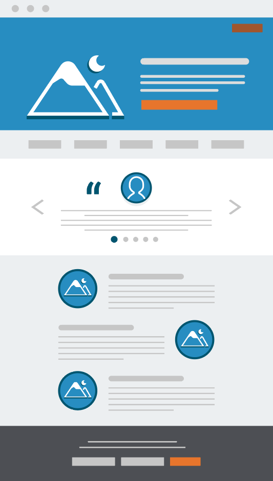
There are a few key ingredients in a great B2B landing page:
Hero image
There is pretty much always a large section at the top with a full-screen image underneath a headline, some intro copy, and a call-to-action (CTA) button. Sometimes, that image is actually a full-screen video that I advise against—more to come on the topic later on.
Once upon a [not-that-long-ago] time, this precious real estate was most commonly dedicated to an elegant screenshot of the product in action, a trend that has faded in favor of images of real people. According to subscription analytics provider ChartMogul, which analyzed 100 B2B SaaS landing pages, 73% of companies are using imagery of people on their landing pages. And most of these images are “above the fold” in the hero image.
Pro tip: People buy from people, which is exactly why a product-dominant hero image has shifted to a people-dominant image. You have customers. Use real images of your real customers using your real product… I know, I know. It’s hard—not to mention expensive—to get those real-life photos, but they’re worth their weight in gold, and you can use them for virtually any kind of marketing asset. It’s like achieving Marketing Nirvana.
Social proof elements
Logo farm
Sure, nearly everyone is touting the customers they serve on their website and landing pages in the form of a row or two of greyed-out logos of companies you’ve likely heard of. And they’re usually at or just below the fold. Adding this little element can make a pretty big impression (though we may be getting “logo blindness” in addition to “banner blindness”). It says that you’ve earned the trust of companies large enough to go through a complex, competitive selection process. This subtle clue can influence conversion positively. It hasn’t gone out of style yet for a reason.
Testimonials
Testimonials are good. Use them.
But use them wisely because not all testimonials are created equal. Some are very general and belong on the homepage (right next to the bus stop we discussed above). Others are relevant to a very specific vertical or buyer persona. Select testimonials that further build congruency between your ad copy and landing page. And don’t forget the headshot. A testimonial without a face is always questionable.
Pro tip: For handy reference, keep a spreadsheet of who said what, when, and where, along with a link to their headshot, vertical, and license type. This reporting will help you not only keep track of the bounty but also identify whom to ask for a review next.
Awards and certifications
Used in concert with logos and customer testimonials, awards and certifications provide a highly robust social proof system. Logos prove that you can outmaneuver the competition in a complex buying process. Testimonials show that folks are happily using your product to their great benefit. And awards and certifications show that independent organizations view your company and product as a market leader and you as the best practitioner. So if you don’t have any “metal” yet, find some competitions to enter or certifications to earn.
B2B landing page design advice
What works well for one company can fail miserably for another. Some buyer types convert best on super plain stuff with zero fluff or flash. Others want to the design to woo them into buying your cool product and will resonate best with a little bling. The structural elements mentioned above are tried and true, but you still need to figure out what works best for your particular business. Test and tinker until you have a conversion rate you’re happy with. And then test some more.
In general, keep your landing pages as simple, scannable, and straightforward as possible. Don’t go too overboard with color and other visual cues that can distract users from converting. Here’s a pretty good read on designing for conversion that includes critiques on a couple of SaaS pages, too.
Navigation
The navigation is definitely a good item to test. There are pros and cons to including navigation on your landing pages. One thing’s for sure: if you include navigation, keep it minimal and only point to core pages.
When ChartMogul took a closer look, it found that the average number of menu items was 4.3 in a sample size of 100 pages. On that note, what cases can be made for and against including navigation?
The Good: Users may want to learn more about your product or company than what the landing page presents. Giving them curated options can avoid alienating these more discerning folks and promote a modicum of brand affinity.
The Bad: People widely believe a navigation destroys conversion rates because you’re giving users an escape route from your carefully crafted landing page.
The Verdict: It depends a lot on what you’re trying to accomplish. If you want to ensure the best possible user experience, then say yes to navigation. On the other hand, if you’re good with taking a hit on user experience to increase conversions, you’ll need to ditch the menu. The breakup may be a little tough at first. It will sting. You may get a call in the middle of the night from Ol’ Nav asking why you broke its little heart. Perseverance is key, as with most things in life.
It’s also worth considering this through the lens of the marketing funnel—including navigation is often good for upper-funnel brand awareness campaigns because it allows users to explore everything you have to offer. But if you’re using a lower-funnel tactic, like asking users to download a resource or get a demo, it’s best to nix the nav so users can’t get distracted with other content and second-guess themselves.
Either way, try to resist linking out to other stuff within the content of your landing pages. Doing so is probably not completely necessary, and the upside is that you’ll reduce distractions and questions for the user.
HubSpotted:
It’s super simple to show and hide your landing page navigation with HubSpot’s module-based layouts. Edit the individual landing page and delete the Simple Menu or Menu modules. And fear not—they can always be added back later.
Content
You’ve heard the expression that “Content is Queen,” right? Well, it’s true here, too. Having the right amount (and kind) of content on a landing page is a tricky business. Too much or too little content will negatively impact conversions. People want to know what they’re getting if they sign up for a free trial or demo. They want to know how your product will benefit them and fulfill their unique needs.
When you’re analyzing content, it’s a great time to put yourself very squarely into the mindset of your users. What’s in it for them?
Focus on the benefits
First of all, every word of copy we write for landing pages should always be about the user and how they can benefit from your product. Shy away from headlines like, “Use Our Software and Get More Revenue!” Instead, you can flip it, so the “you” comes first: “Get More Revenue With Our Product!” That way, it’s no longer “i” before “e”—it’s “you” before “me.”
With that said, the next step is to be judicious with the overall tone of your copy. There are four basic types of messaging:
- Love-based: sews some positivity and educates or reminds users how your offer will benefit them.
Ex: “Automate at Twice Your Current Speed.” - Fear-based: highlights what happens if a user fails to take action.
Ex: “Don’t Get Left in the Dust by Your Competitors. Offer Ends Tonight.” - Duty-based: obligates a user to fulfill a time- or value-oriented goal.
Ex: “Are You in the Loop? Here’s What You Need to Know About the Latest AI Feature.” - Greed-based: conveys something new and enticing to elevate the user’s status or wellbeing.
Ex: “Say Hello to 516% ROI.”
When it comes to writing copy—and positioning your product in general—resist the urge to induce fear and duty in particular. Greed-based messaging will typically work best with your economic buyer. Regardless of your focus, you should always know your audience, or at least know whom you’re targeting with your ads. With a specific persona in mind, you can reverse-engineer a compelling message that will convert.
With sentiment becoming more important than ever in our society, it’s crucial that you keep things real—especially since AI is increasingly consuming content, categorizing it, and giving preferential treatment accordingly across social media and the rest of the web at large. And spread some joy while you’re at it—it never hurts to make people happy.
Show, don’t tell
There has been a relatively slow evolution in the way tech companies position their products. We all know and love the treasured zig-zag approach that Apple pioneered… product screenshot on the left and microcopy on the right, alternating down the page. This layout has worked well and continues to show up on a seemingly infinite number of B2B SaaS websites.
But this trend is facing a formidable foe (even though they go together, in my opinion): More and more software companies are showing a narrow glimpse of the product instead of a full screenshot, traditionally presented on a MacBook or mobile device. Here’s an example from our favorite project management tool, Asana:
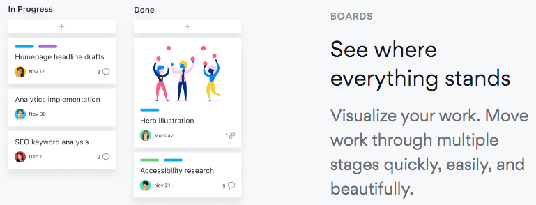
Coincidentally, the sample project is also about developing a web page!
In 2015, tech-ubiquitous productivity company Slack launched a new campaign called “Animals!” with two 60-second ad spots that started showing up all over the technosphere. Here’s one of them:
This ad is especially effective because you hardly see Slack or any of its myriad of impressive features. Instead, you watch a colorful story unfold quickly where a new idea (flying umbrellas, oh my!) is presented and brought to market in record time, by animals! It was dead simple, appealed to massive and tech-agnostic audiences, and got shared a lot. Plus, it made Slack’s early adopters feel cool and validated.
The company launched another crafty, industry-shaping campaign in 2018. It’s not nearly as popular, but you have to admit that the mashup of Slack interface meeting campy, semi-real life is pretty clever:
Both approaches work really well to sell the product because they show the benefits of Slack rather than explaining the details of feature after feature. At a certain point, it doesn’t matter what your product does—it matters what your product does for your users.
Be honest
Honesty is the best policy. For starters, don’t sell something your product doesn’t do. Lying doesn’t make you a good neighbor to the Sales, Product, and Service teams that also work on your app—nor does it make for happy customers that retain and drive increasing monthly recurring revenue (MRR). Conversely, don’t oversell something your product doesn’t do well, either.
Pro tip: Not sure what to write or how to position your product? Call up your customers and ask them what their tipping point was for buying. Even better, ask them what they would tell a friend if they were recommending your solution. Most people don’t remember the exact thing that makes them convert, so both data points can be insightful.
B2B SaaS call to action (CTA)
We can’t talk about landing pages without talking about CTAs. It’s like talking about puppies without obsessing over how cute they are. On that note, time for a shameless puppy break:
Now back to CTAs, albeit reluctantly.
Just kidding. I <3 B2B CTAs! Your CTA is the lifeblood of the page. It’s the thing that compels users to take the final step and convert. This section will explain how to create the best CTA for B2B lead capture and conversion in the B2B industry. Up to the point of answering the CTA, the user has made a series of micro-conversions like:
- Clicking your ad.
- Reading the headline.
- Viewing imagery.
- Reading supporting copy and so forth.
Once the user fills out your form and converts, that’s a macro-conversion. When looking at the process through the lens of micro- and macro-conversions, it’s easy to see where the CTA carries so much weight. Let’s talk a little about how to distinguish these gems because the most important thing is to make sure that they stand out.
Length and specificity
Chart Mogul’s research showed that 92% B2B landing page CTAs are fewer than five words long. While the industry at large seems to have moved away from the dreaded one-word “Submit” button, keeping it short and simple is still best. Think along the lines of “Start My Free Trial Now” or “Schedule a Demo.” Sometimes, even just “Let’s Chat” can work if the rest of the content is compelling enough and creates the urgency necessary to win over users. When in doubt, be action-oriented, urgent, and specific, like “Download Your Free eBook Today.” You can always test variations to find what the best B2B CTA.
Placement
Most of the best SaaS landing pages these days—particularly for companies that sell to other businesses—have a button in the upper right and another button (or two) on the page, like so:

That top button will most commonly “stick” to the top of the page as a user scrolls. It will often change colors or size as well. The primary benefit of this method is that the CTA will always be present. So once the user gets to the area below the fold where the testimonials and features are in the example above, they can convert effortlessly at any point in between the buttons on the top and bottom.
Color
According to Chart Mogul, 68% of 68% of B2B landing page CTAs for B2B SaaS solutions are either green or blue (sorry, remaining colors of the rainbow). And I bet that’s not so coincidental. Looking through their sample, you can tell that blue and green are probably the top two colors represented in B2B palettes. This standard might make an easy opportunity for you to break out of the mold and cut through the noise.
A high-contrast color palette is a good thing—particularly concerning your CTAs. Notice in the screenshot above that the buttons are all orange, but nothing else on the page is. That’s highly intentional. Visual cues like color, size, and typography help set the most important actions apart. So be sure to differentiate the overall design from the look and feel of your CTAs.
Pro tip: Use a contrast checker to ensure that the color of your CTA stands out sufficiently from the rest of your content (particularly in the space immediately surrounding it). While you’re at it, this contrast checker will help ensure that your color palette is accessible to folks with visual impairments, too, which is becoming an increasingly important ranking factor.
HubSpotted:
You can create and keep track of all your CTAs in HubSpot, allowing for split testing on any landing page. Plus, you can even personalize CTAs for users who have previously converted. For example, your button could say “Download a Free Trial for WebMechanix.”
As you can see, optimized CTAs are essential to B2B product pages and landing pages. With these simple tips, you can improve that clickthrough rate of your B2B CTAs.
Wrapping it all up
As you can see, the anatomy of a well-optimized B2B SaaS landing page comes down to nailing the fundamentals first, which involve great design and social proof. Then, you must optimize the landing page further by improving the navigation, contact, and call to action with the B2B landing page best practices mentioned. Let’s face it; the word of B2B software is a special world that doesn’t always follow the best practices of other Industries. By following this guide tailored to this industry, you have a much higher chance of increasing your conversions, which means more dollars in your pocket every month. We’ve worked with dozens and dozens of companies in this industry as an agency, so you can trust our experience and expertise. What was your favorite tip?
Want a FREE Masterclass in B2B SaaS automation? Watch a free webinar here.
Most newsletters suck...
So while we technically have to call this a daily newsletter so people know what it is, it's anything but.
You won't find any 'industry standards' or 'guru best practices' here - only the real stuff that actually moves the needle.
