Living in the Land of Bartonia, or Why to Design with Details
In these most unusual and trying times (sick of hearing that yet?), a little entertainment can go a long way. Whether it’s a Netflix binge, a board game with the family, or online video gaming, the littlest diversions can help alleviate a world of stress—which is why I feel the need to talk about Animal Crossing: New Horizons.
I didn’t really expect to play this game. But the furious energy and passion of our creative staff for the game’s launch (prior to the national lockdown) fueled my curiosity. And if there’s one thing universal to all creatives, it’s curiosity. So, late to the party, I installed it—and behold, I’m addicted. Tiny, charming, chirping animals asking me to build houses, clean up an island paradise, and plant fruit trees? I’m all in.
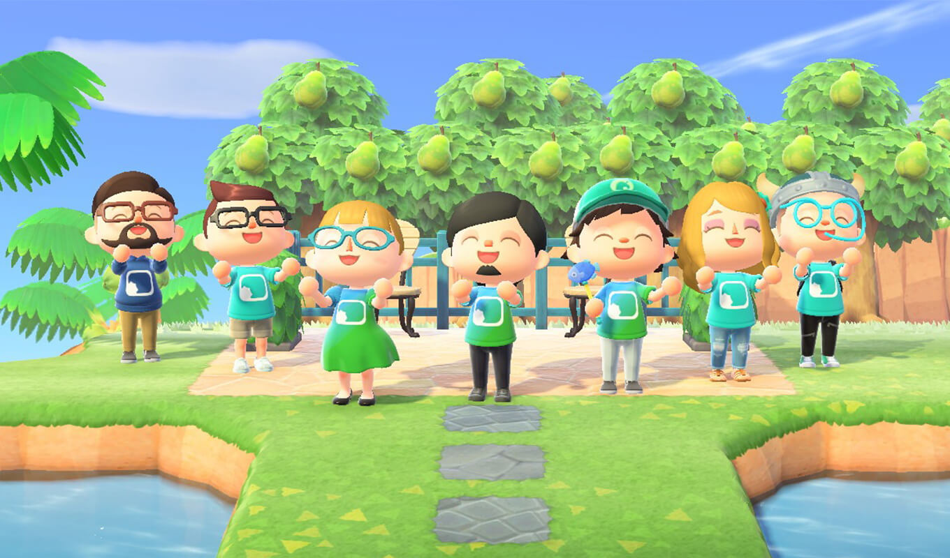
We can name our individual islands (mine is Bartonia). We even can customize the shirts we’re wearing based on personalized pixel art (and as a creative team, we took a group shot wearing our company logo, created by two of our own).

Nintendo considered every intimate detail, from the faint chirping of an underground cricket nearby to contrails in the sky where visitors are “flown in” (thanks to Dennis Zechman for pointing that one out), to the shaking of the trees when a strong wind blows through. The scope of this game is staggering.
So what does this have to do with work? A lot, actually. When you’re designing a product or website for an audience, imagine what it would be like to interact with it. Is it interesting? Surprising? What if it’s just a transactional site or B2B site with a low engagement expectation? The point to consider here is detail. There are some very simple things you can do to make your site as interesting and rewarding as possible.
Enter the micro-interaction—elements defined as small, singular actions that delight the user when engaging with an interface. The subtle size change of a button when rolling over it, an expanding panel that cleverly springs with a bit of bounce, or the animation of elements on the page as you scroll up and down. All of these increase a user’s engagement and, in turn, their perception of your page’s (and brand’s) quality.
As digital creatives, we know that the devil’s in the details. And micro-interactions can add such subtle details that the perceived value of a page can quickly increase.
To quote Vamshi Batchu of the UX Collective:
“Attention to detail is what basically differs an exceptional website from an ordinary one.”
There are plenty of posts breaking down micro-interactions (of which this one is very comprehensive). In short, there are a few that we consider to be essential: navigation cues, button interactions, and simple animations.
Navigation Cues
When a user visits a site for the first time, there are certain things that they expect. Your products or services will most likely display at the top of your screen. If visitors want to search or contact you, they’ll probably shift their eyes to the top-right where those elements are usually found. And if they want to dig deeper, they’re going to scroll over options to see if there are additional categories from which to choose.
A simple, animated element that follows the user as they navigate from one option to another can help retain their focus and interest. A smooth transition into a sub-navigation menu can ease the stress of searching for additional options. In short, these simple visual prompts help create a much better browsing experience for your users.
Button Interactions
From the first time a user visits your site until the moment they purchase or become a lead, you’re leading them to take action. Part of UX philosophy is to treat your call to action and button elements in a uniform way to indicate, at any stage of the journey, what you want your users to do. However, most sites stop short at color and shape.
Imagine how much more interesting or appealing it would be if the button did something. It doesn’t have to jump off the page. A subtle color shift, the skeuomorphic behavior of mimicking a physical press, or even slight animated shape changes can go a long way to making the “rollover and click” interactions much more rewarding.
Subtle Animations
In the beginning, the web was filled with text, and the word was text, and thus ended the site. But we’ve come a long way from the early days of informing readers, prospects, and customers. Content presentation has become ever more sophisticated, with explainer videos, parallax images, and interactive infographics.
But there’s even more we can do. Consider the simple act of fading in content as a page scrolls or subtly moving a content card in response to a user’s cursor (as Apple TV does on its titles). Facebook does this wonderfully by playing little animations for your likes, loves, and laughs. Even now, I’m watching Grammarly subtly running an animation in the corner of my screen (a page filling with content, ending with a bouncy green dot) to ask if I am ready to use their product.
All of these things create a feedback loop to actively involve the user in the experience, rather than keeping them a passive consumer. These little actions, designed not to scream for attention but to breathe life into a page, can drastically enhance an otherwise lackluster user experience.
So get out there and create tiny, useful details. Elevate your content and journeys with things that keep your users’ attention in wonderful ways.
And if you need me, I’ll be planting virtual flowers while I chat it up with a brightly dressed monkey, feeling the virtual breeze in a land that reminds me how important the details can be.
Most newsletters suck...
So while we technically have to call this a daily newsletter so people know what it is, it's anything but.
You won't find any 'industry standards' or 'guru best practices' here - only the real stuff that actually moves the needle.


