Why We Suggest Responsive Web Design For Mobile Sites
It’s 2015 so we probably don’t need to tell you that having a mobile website is important. Whether it’s navigating, shopping, or researching, smartphones and tablets are the first place people turn for information.
But just in case you’re not convinced about the importance of having a mobile-friendly website design for your business, here’s some quick stats:
- According to a Google AdWord’s 2015 blog, New insights launched to help marketers capture the micro-moment opportunity, half of all US Google searches come from people on mobile devices
- A 2013 Google Nielsen report called Mobile Path to Purchase found that people spend more than 15 hours per week on mobile research
- The same report found that 93% of people who used mobile to research go on to make a purchase
- An article from the Google Mobile Ads Blog titled “Mobile-friendly sites turn visitors into customers” found that 48% of people said visiting non-mobile websites made them feel like the company didn’t care about their business
- The same article found that 61% of people quickly move on to another site if they can’t quickly find what they’re looking for on a mobile site
And one of the most important reasons to go mobile,Google is demanding that webmasters upgrade their sites to be mobile-friendly and they’re suggesting the use of responsive website design. They’re doing this by penalizing anynon-mobile webpagesinmobile search results.
But if your webpagesaren’tmobile-friendly yet, don’t worry. This is definitely a situation where it’s better late than never and there’s also plenty of time to catch up — only 11.8% of websites use responsive website design (and an even smaller percentage are using other mobile-friendly design options).
What’s Google’s Mobile-Friendly Update?
Google’s mobile-friendly update penalizes websites that do not offer a mobile-friendly experience (e.g. small font sizes, pinching and zooming needed to view the whole page, etc.). The update went live on April 21st and has been dubbed “Mobilegeddon” by webmasters around the world.
The update sorts your site’s pages into two categories: mobile-friendly and not mobile-friendly. If a page is found to be not mobile-friendly, Google penalizes the page. The update also operates in real time, so if you update the page to make it mobile-friendly, the fixes will almost be immediately registered by Google.
You can find out if your website is safe using Google’s mobile-friendly testing tool. You can also read more about Google’s official definition of “mobile-friendly” in their blog post on “Mobilegeddon.”
Going Mobile with Responsive Website Design

You can make your website mobile-friendly a variety of ways, but we’re going to be talking about using responsive website design (RWD). Why RWD? For starters, RWD is what Google suggests using for a mobile-friendly website; your content is easier for them to locate and faster to serve search engine users.
Here are a few other reasons companies should use RWD:
- Low cost to manage the website
- Easier for users to share and link your content
- Good for SEO because Google better understands sites using RWD
What Exactly Is Responsive Website Design?
Responsive website design is a way to create webpages that automatically scale to the right screen size. It’s often easiest to see RWD in action, and fortunately for you, our website was developed using RWD and serves as a great example.
To see RWD in action on our website, you can:
- Visit our site on mobile and then on desktop and compare the differences, or
- Resize one of our webpages on your desktop and see how elements adjust to fit the new window size
With RWD, important parts of the site, like our navigation and phone number, are easily clickable by people using mobile phones. Content also shifts around so that you don’t have to horizontally scroll to read everything on the page. Convenient for the user and wonderful for anyone managing the site.
To learn more about responsive website design, you can check out any of our following resources:
- “Responsive Website Design or Mobile Site: What’s Best for Your Business” blog post
- “Do You Need A Responsive Website? Short Answer: Yes” blog post
What Are Other Mobile Website Options?
We prefer responsive website design for creating mobile-friendly websites, but there’s an exception to that: sometimes responsive website design simply doesn’t make sense for your website. So if you’re one of the few that falls into the exception, what other mobile website options are available?
Dynamic Serving
With dynamic serving, your website has multiple versions (e.g. smartphone, tablet, and desktop). When somebody visits your site, it determines what kind of device they’re using and then serves them the relevant website version.
Pros
- Allows for unique mobile/desktop content
- Good for SEO
Cons
- Slower load times
- High implementation & maintenance costs
- Need to specify & match device types
Dedicated Site
Dedicated mobile sites are very much what they sound like — a completely separate instance of your site designed for mobile devices. This was one of the earliest and easiest ways to go mobile, but it comes with countless technical frustrations to upkeep.
Pros
- Allows for unique mobile/desktop content
- Low implementation costs
- Fast load times
Cons
- Bad for SEO
- High maintenance costs
How to Calculate The Value of A Mobile Website
Mobile websites are undoubtedly valuable for users. But for businesses, the costs of building a mobile-friendly website need to be exceeded by your anticipated return. So how can you calculate the value of a mobile website?
Here’s our simplified formula for figuring out how important mobile is for your website:
- Determine average number of visitors & conversion rate on mobile devices
- E.g. 1000 unique visitors/month & 0.5% conversion rate = 5 conversions/month
- Determine average number of visitors & conversion rate on desktop devices
- E.g. 9000 unique visitors/month & 2.0% conversion rate = 180 conversions/month
- Calculate expected gains from a mobile optimized website
- E.g. 1000 unique visitors/month & 1.5% conversion rate (estimating 75% of desktop performance) = 15 conversions
- Balance the cost of making your website mobile-friendly with your anticipated gains/losses
- E.g. ~$15,000 making website mobile-friendly < $ value of 15 conversions/month
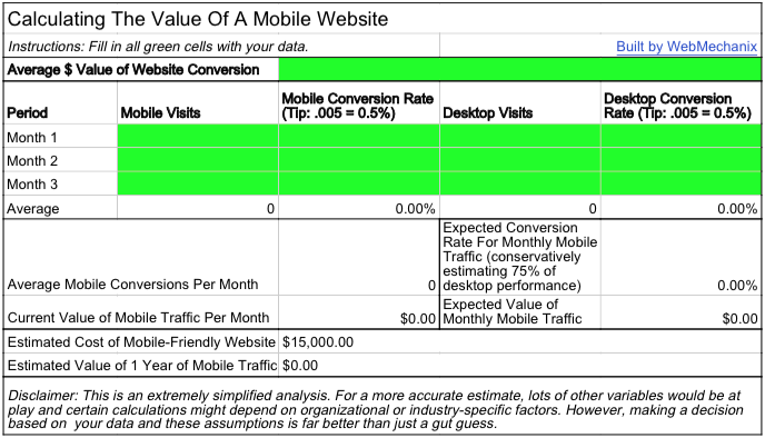
If you want to calculate the value of a mobile-friendly website with your own data, you can use our spreadsheet calculator to get a rough estimate of your mobile traffic’s value.
Talk To OurMobile Usability Strategists
Want to learn more about responsive web design and if it makes sense for your company’s website? Our team would be happy to walk you through the process of making your website mobile-friendly.
You can give us a call at 1-888-932-6861, send us an email at [email protected], or click the button below to request more information.
Most newsletters suck...
So while we technically have to call this a daily newsletter so people know what it is, it's anything but.
You won't find any 'industry standards' or 'guru best practices' here - only the real stuff that actually moves the needle.


