7 Best Practices for Conversion Rate Optimization for Leads
Most marketers play around with content, layout and design changes meant to increase conversion rates on certain landing pages or website actions. You may even be A/B split-testing changes to confirm if they’re winners.
But if you’re testing mostly superficial elements like button color or font, you’re missing the mark.
I know what you’re thinking: “I’m just following best practices. People like clicking on green buttons more than they do on red buttons, right?”
Maybe. But maybe not.
We’ve run thousands of tests across pretty much every industry you can imagine and the fact is, “best practices” are kind of baloney when it comes to conversion optimization tips. Because what works for your audience may not work for mine.
So what’s a marketer to do?
Forget best practices. Use principles instead—immutable truths, based on fundamental tenets of human psychology. Here’s a quick run-down of 7 Core Conversion Principles that should underpin your strategies and decisions.
1. Tune Your “Unique Value Proposition” (UVP)
Sometimes called a “Unique Selling Proposition,” sometimes referred to as “positioning” or “differentiators” or “appeals”… There are a bunch of names for your Unique Value Proposition.
But the fundamental question is: Why should I buy from you instead of your competitor?
Testing unique appeals will yield you more impactful results than testing button colors. What’s more, when you find an audience that connects with your UVP, they’ll turn into lucrative and loyal customers at a higher rate.
For an interesting take on this, check out MECLABS’ Conversion Sequence Heuristic.

This sequence lays out elements of conversion in order of importance. While I’ve always believed that value proposition was #1, in the Conversion Sequence Heuristic it was #2 after “how visitor motivation matches the offer.”
Makes sense, right? If visitors don’t first have the motive to buy, then it’s going to be really hard to sell the value prop.
But here’s the thing: we can’t control what motivates visitors. That’s their deal.
What we can control is our value proposition.
So, focus on making your value proposition stellar. It’s what’s going to set you apart from your competitors. Clearly convey it in a way where visitors will understand it within five seconds of landing on your website.
Having a one-of-a-kind differentiator isn’t the only thing you should consider when brainstorming what your value prop should be.
If your offer is exclusive and not easily duplicated by your competition, but nobody wants it—it’s useless. Your value proposition has to be appealing to your audience.
As I mentioned, it has to be understood within five seconds so visitors don’t click off your site. In essence, your value proposition must have clarity.
Each and every product or service that you offer must clearly define and differentiate its unique value from your other products and services. Otherwise, your offerings may all just blend in together for your prospects.
Here are some more detailed techniques to test different value propositions.
2. Build Trust
You may feel that you have a really valuable product or service to offer consumers. But from your visitor’s perspective, they don’t know you from Adam. You’re one of hundreds, perhaps even thousands of competitors in your industry.
If they haven’t done business with you before, there’s going to inherently be some skepticism. Visitors are looking for indicators that they can trust you. And it’s your job to provide those indicators. Or lose business.
One way you can establish trust is by creating an About Us page. I know a lot of websites are skipping past providing this page because they want to keep their audience focused.
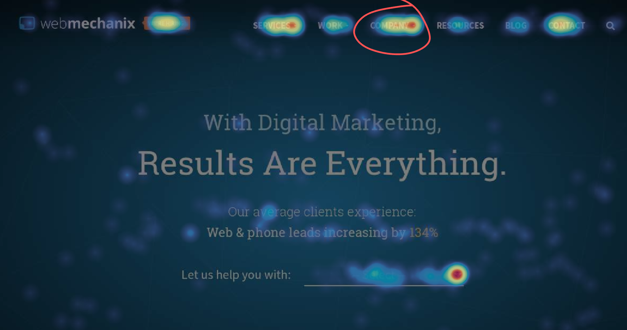
But time and time again, I’m surprised at just how many people are clicking on “About Us” links when I review clickmaps. That’s because there’s always likely to be a percentage of people who want to know more about a business before they actually do business with them.
A few other things you can do to establish trust: Display security seals so visitors know your site is safe. Add real world data such as addresses and phone numbers so they know you’re a real business.
You should also add social proof, such as testimonials and reviews, so users feel secure that others have used and liked your products and services. According to Search Engine Land, 85% of consumers will first read up to 10 reviews before feeling as though they can trust a business.
3. Be Relevant
If you try to sell the wrong product to the wrong person at the wrong time… good luck.
On the flip side, selling the right product to the right person at just the right time? Success!
In the end, it’s ALL about the customer. Not you. Provide info and speak in a way that’s relevant to them and you will win them over.
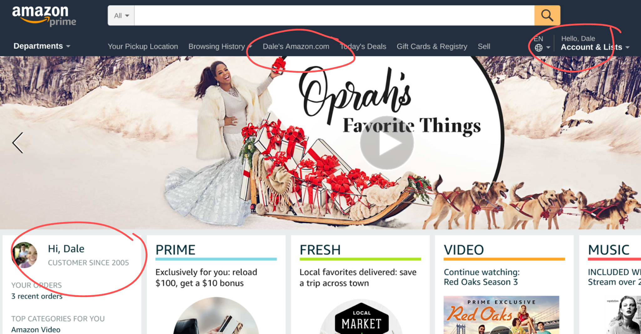
Amazon does this with personalization all throughout their website—from the moment customers log in and see their name, to being presented with products they might be interested in.
It’s also essential to speak to your target market.
If you try to speak to everybody, you really speak to nobody at all. You can’t possibly address the very specific needs of individuals if you try to use a mass blanket selling approach.
When you’re able to identify your audience’s unique needs and speak specifically to those needs, then you can hit a nerve directly.
4. Be Clear
Simple, right?
You’d be surprised at how many people screw it up.
If you’re trying to cram a ton of info into your message, you’re likely confusing the heck out of people.
Don’t try to be “cutesy” or mysterious or create curiosity. Your visitors don’t have time for that. They want to know what you offer and why they’ll be happy choosing you.
So give them what they want. And tell them what to expect throughout the process.
If they purchase a downloadable ebook, let them know they’ll immediately be brought to a download page after their transaction is complete. Or, offer a demo or graphics to show them how your product or service works.
And gosh darnit, make your links look like links and make your buttons look clickable. Don’t just assume visitors will know they’re clickable. Most of the time, they don’t.
Why not just say, “click here” and make your links blue and underlined like users have come to expect?
5. Amplify Desire
Here’s where a lot of marketers put most of their focus. Yes, it’s important. But make sure you also focus on the other principles to support it.
When you’re attempting to get people to sign up for a newsletter, share something on social media or take some other type of action—offer something for free. My newsletter subscriptions grew tenfold when I gave away a free ebook if users signed up for my newsletter. The ebook took a week to create and after a year it helped produce a 10,000-subscriber list.
Use button text that gets the blood flowing. Text such as “Submit” rarely wins in split tests. And in some instances button text such as “Continue” can be very vague. Be sure to include the benefits visitors will receive when they click your button. Text such as “Get Instant Access” or “Improve Sales” conveys benefits, whereas text like “Sign Up” might not.

And don’t only try to make your product desirable. Also convey to your visitors why they need it.
According to Zig Ziglar, “Every sale has five basic obstacles: no need, no money, no hurry, no desire, no trust.”
This article focuses on ways to build trust, create desire, and add urgency. But it’s also really important to be able to convey why they need it. In a way that feels like they won’t survive without it.
6. Eliminate Friction
This is probably the area where I see the most issues. Companies make it difficult for their visitors to get through their funnels. Simple things like asking for too much information will hurt your conversions. I saw a contact form that had so many fields, it just wasn’t worth my time to fill out.
Another time, I clicked an email link, but an Outlook window popped up asking me to set up Outlook. I don’t use Outlook! I use Gmail. So this was a frustrating usability issue.
Just making contact shouldn’t be that hard.
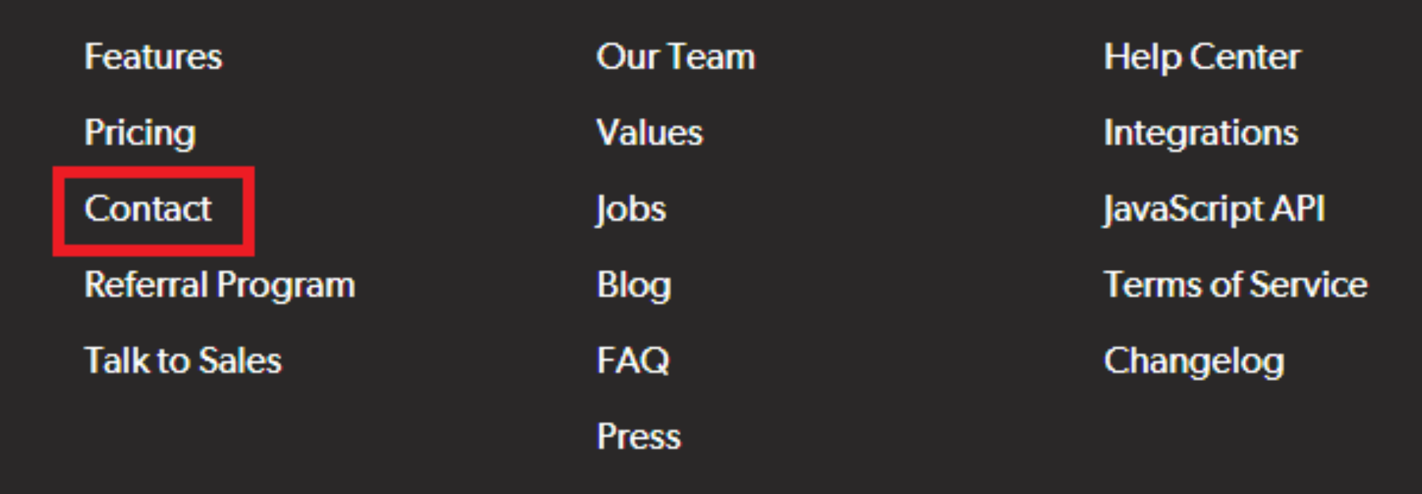
But you’d be surprised because many sites hide their phone numbers and contact pages, making it nearly impossible to make contact.
Here’s an example where the only method to make contact is buried in the footer menu:
Make it easy to contact you!
7. Add Urgency
And, finally, add some urgency. There are a lot of instances where visitors are interested in a product or service, but life takes over. They become distracted. Intentions of putting off a purchase to buy “later” often turn into “never.”
Emarketer once revealed that when visitors add an item to their cart, a whopping 56% intend to save their cart for later.
Scanalert went on to break it down further, revealing the lengths of time shoppers typically wait.
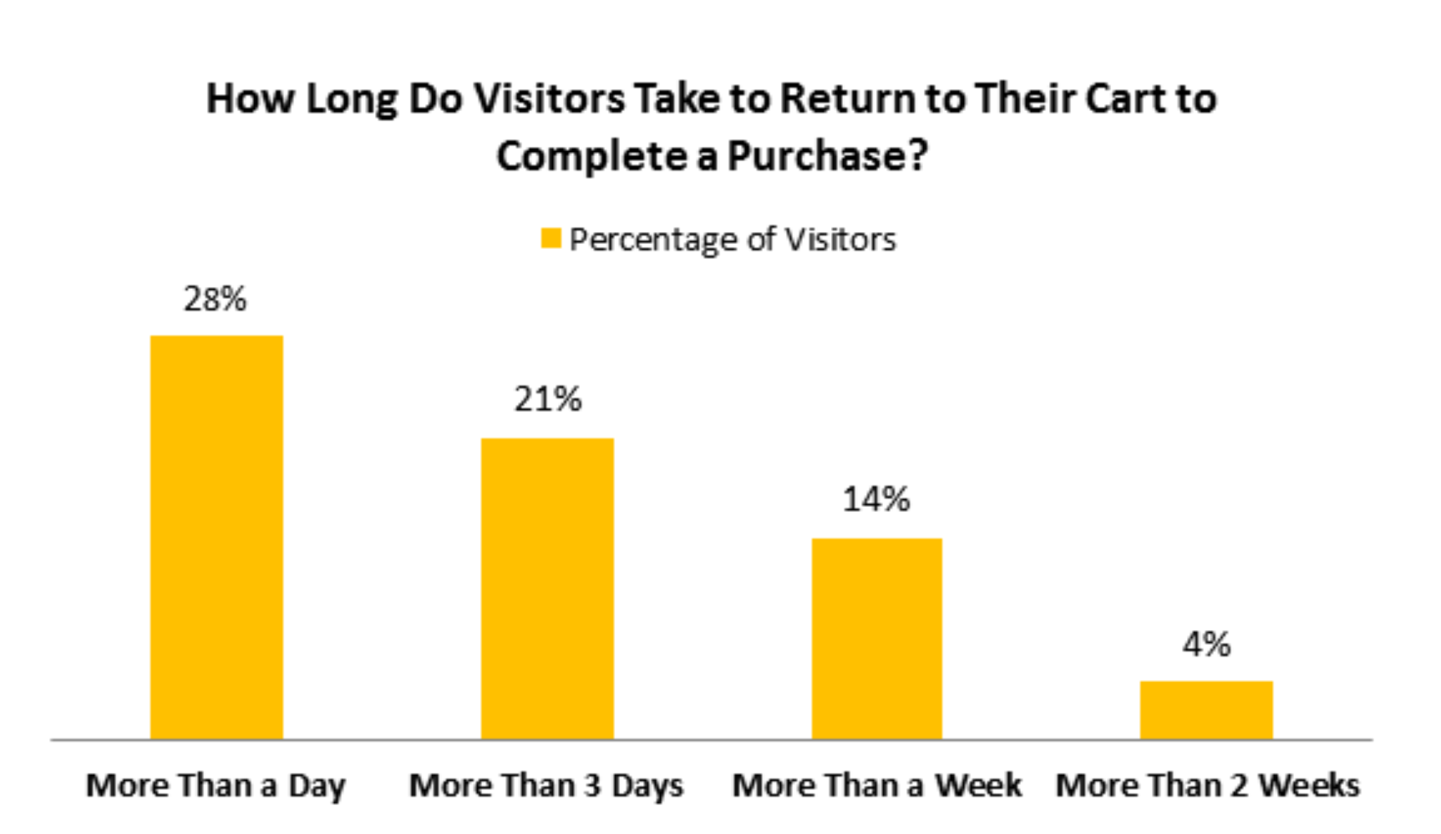
According to their research, which involved eight million consumers, 28% of visitors took more than a day to complete their transactions. 21% took over three days, while 14% completed their transactions in more than a week, with 4% taking more than two weeks.
So what’s the answer? Add some incentive to push them to buy now.
For shoppers who’ve left their carts behind, companies should follow up with an email reminder.
Exit intent is another great way to reach out and continue to market to visitors as they’re abandoning your website. Deadline-driven sales and promotions are also helpful.
Now Let’s Get To Testing
So there you have it.
Incorporate these timeless truths into your conversion optimization strategy and you’ll be posting business-building wins before you can say “green button or red.”
Contact us if you’d like some help (we don’t bite …usually)
Read more about A/B split testing and conversion rate optimization
Most newsletters suck...
So while we technically have to call this a daily newsletter so people know what it is, it's anything but.
You won't find any 'industry standards' or 'guru best practices' here - only the real stuff that actually moves the needle.


