Landing Pages in a Web 2.0 World
Web 2.0 has naturally forced the evolution of many online marketing principles and landing pages are no exception. The purpose of a landing page is to spark action by a web user who has just clicked on an online advertisement or special offer.
Generally speaking, the effectiveness of a landing page is measured by its ability to get a prospect to convert by filling out a form and submitting their contact information.
The landing pages that I have seen converting higher than others as of late each contain the following handful of characteristics.
Landing Pages with Congruent Messaging are Dominant.
Picture this – Newlyweds Mary and Jack just hosted their first holiday party for the whole family at their new house. The party was a success, but Mary and Jack are bummed because Great Uncle Steve dropped his cigar and burned a hole in their new rug.
Mary takes action the following Monday by googling “repair cigarette burns in carpet.” A savvy local carpet repair service happens to be bidding on that exact keyword phrase and even echoes the keywords in the headline of the associated ad. This of course excites Mary because it’s exactly what she’s looking for, so she clicks through.
The moral of the story is that, in a Web 2.0 world, if the ad Mary clicks on clicks through to a landing page also echoes that headline and exact keyword phrase, Mary is 3 times more likely to convert by submitting her contact information.
Landing Pages must keep the End Goal in Mind.
Remember that the whole purpose of a landing page is for prospective buyers to convert by filling in their contact information. Therefore, a landing page with options to do anything other than that is not optimized to its fullest potential.
Video demonstrations and links to a Better Business Bureau profile are good credibility builders, but this is not the right instance to incorporate either. Simply put – the best landing pages feature forms easily completed, painfully obvious, and in plain sight.
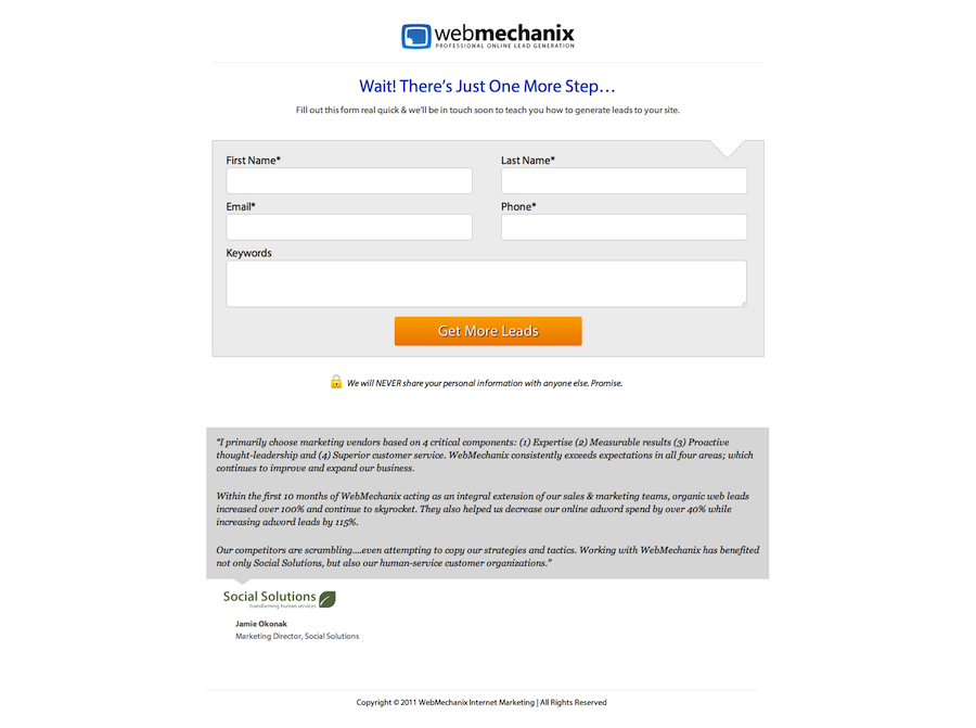
Making the form as easy as possible to complete is important. First, it’s always a good idea to limit the number of required fields as much as you can. Ideally your form will only require only the big 3 – Name, Email, and Phone Number.
Web 2.0 Landing Pages are Smart
The form within a landing page also needs to be coded in a way that ensures simplicity for users as well as quality control for your sales staff or whoever is receiving the leads.
So if a prospect is filling out a form and I enter their phone number in a 1234567890 format (as opposed to with the dashes, e.g. 123-456-7890), the form should be smart enough to not return an error message. An error message here could frustrate the prospect and put you at risk of losing the lead, and that would be a shame because it’s something you could have prevented.
However, let’s say that the prospect enters a phone number with fewer than 10 digits (e.g. 123456). In this circumstance, the form should recognize that there are not enough characters to constitute a legitimate phone number and proceed to give an error message requesting a 10 digit phone number. This will minimize spammy or bogus leads.
Here are some good examples of Web 2.0 Landing Pages WebMechanix has created:


What is your approach to building landing pages in a Web 2.0 world? Share some knowledge in the comments section!
Most newsletters suck...
So while we technically have to call this a daily newsletter so people know what it is, it's anything but.
You won't find any 'industry standards' or 'guru best practices' here - only the real stuff that actually moves the needle.


