The Definitive Guide To Crafting Effective Display Ads That Win the Click
With the constant whir of activity emerging from our pockets and screens, everything is vying for our focus.
According to the book The Attention Merchants: How Our Time and Attention Are Gathered and Sold by Tim Wu, attention is a commodity, and advertisers are buying and selling attention every millisecond of every day across billions of places. Advertising has even made its way to outer space (Pizza Hut made it to the ISS)! This massive influx of information has led to a phenomenon called banner blindness; you’ll learn how to fight it and win the click in this guide.
I’m going to explain how we interpret ads psychologically, briefly taking a step back from the ad itself. Then, I’ll teach you how to capture visual attention with effective display ads. Next, I’ll show you eight copywriting tips and my testing process. And finally, I’ll go through some real examples.
Table of Contents:
- How we interpret ads psychologically
- How to capture visual attention with display ads
- 8 copywriting tips to win more clicks
- My 5-step testing process
- Real-world display ad examples
But before we even get into how to write ads, we need to learn how people perceive them.
This data showing how users treat ads will make you change your whole approach
In April 2018, Nielsen Normal Group used eye-tracking software to learn how users view search engine results pages (SERPs) and blog posts. The red dots in the images below show where people actively gazed, and the red lines denote the paths their eyes followed between those gazing points. As the users’ eyes moved, even though they might have glanced at the content, their brain didn’t register anything being said.
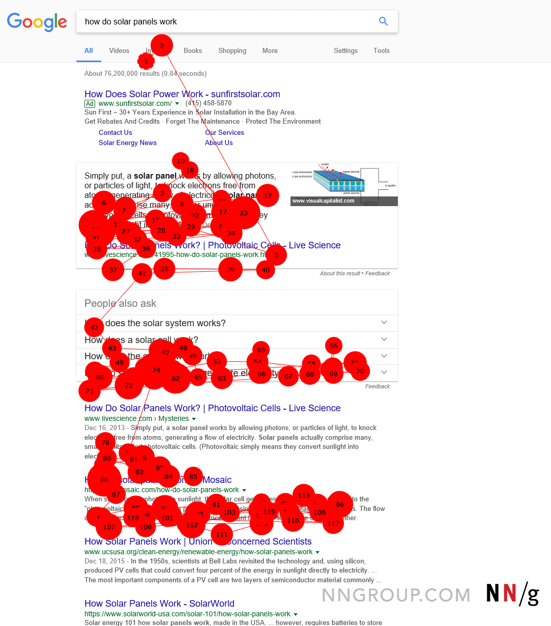
Notice how all of the focal points cluster near the main listings, but there are no focal points for the ad at the top. Nielsen confirmed that people grew accustomed to where ads were located and unconsciously ignored them.
Further, and perhaps more importantly, the researchers observed that if something looks like an ad, even if it isn’t one, users will still ignore it. Banner blindness is powerful.
The page below doesn’t have a single display ad on it. In this case, a promotion looks different from the text and photography on the site. It’s a small, rectangular shape with fancy formatting, a colored background against the white page, and embedded text in the image. All these traits are common properties of display ads.
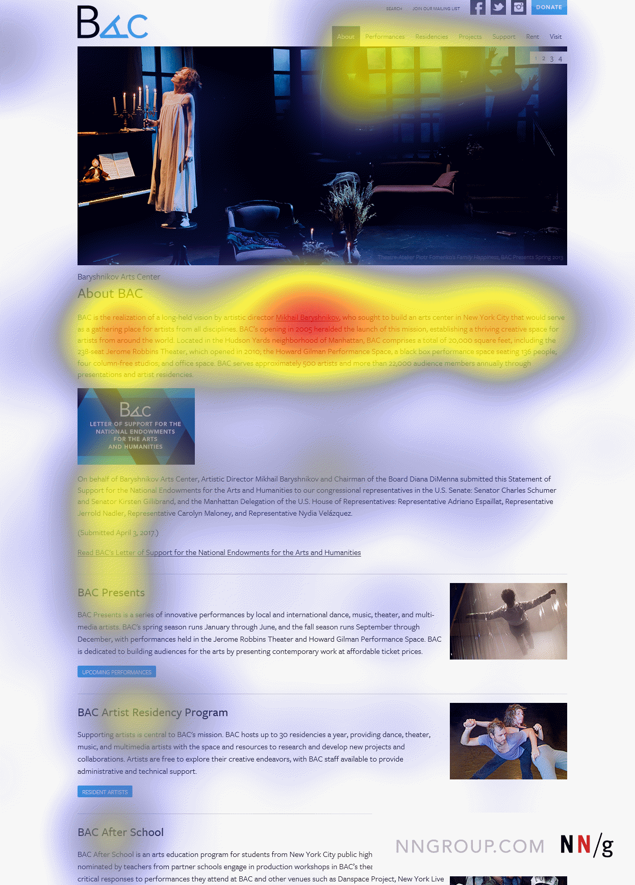
Users play hot potato with entire sections of a site or page. If they don’t like specific content, they swim around it.
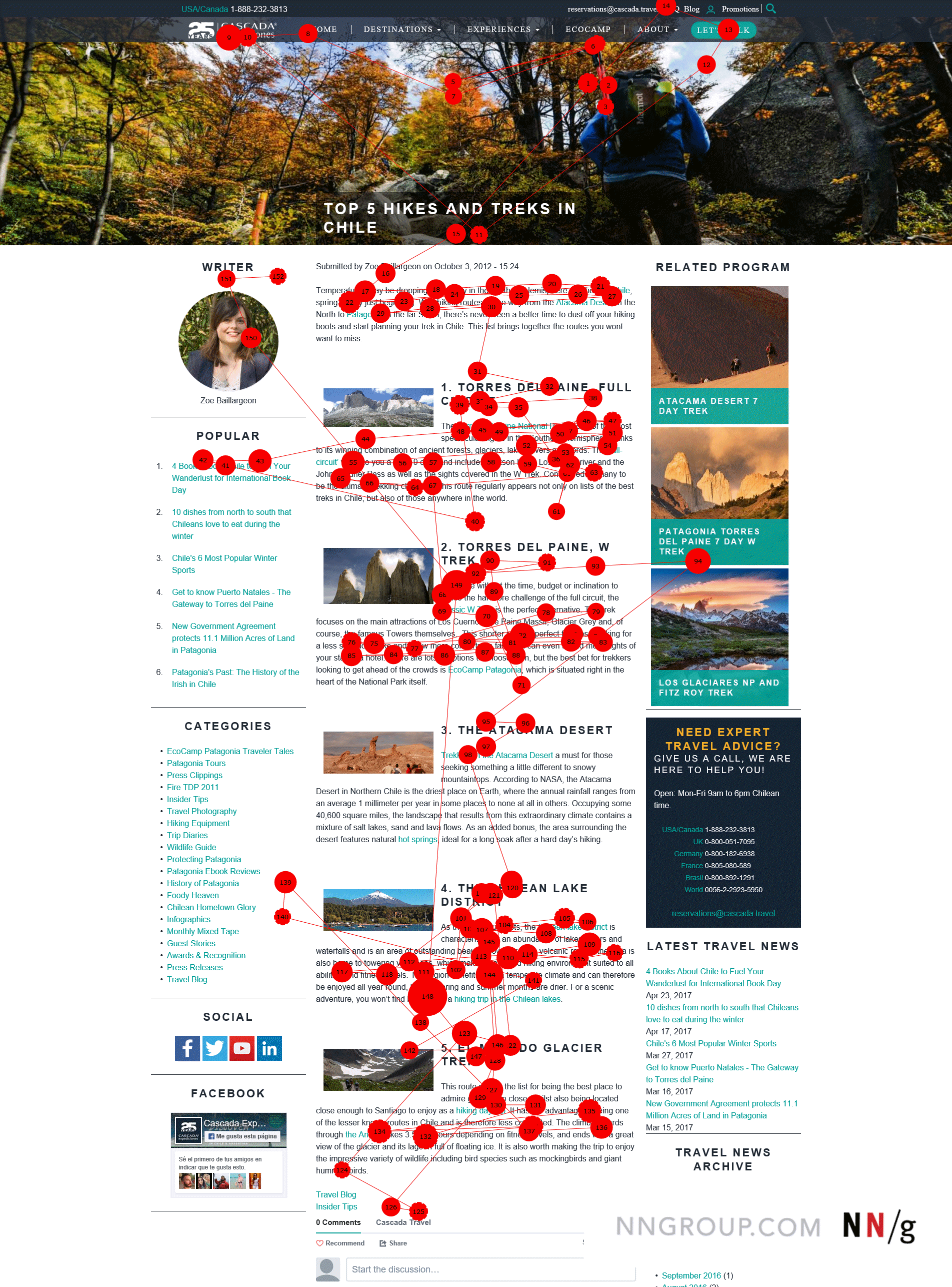
Notably, Nielsen’s study found that 86% of users didn’t look at the sidebar content. In the next image, even though the sidebar contains information related to what visitors are actively looking for, they never actually look at it because it resembles an ad. On blog posts with display ads, people aren’t even glancing at the sidebar—they’re only viewing the main content.
A different research study by AdKeeper and 24/7 Real Media on why users don’t click ads found that 61% of users reported irrelevance to their current activity as the top reason for not clicking ads. Here are some of the other interesting findings from that study:
- 58% say online banner ads are not that relevant to them.
- 54% don’t trust most online banner ads they see.
- 31% are worried that their Internet behavior will be tracked.
While these stats are from 2011, it’s safe to assume they have remained constant or increased as noted by the advent of ad blockers, ad-skipping DVRs, and greater privacy issues involving Facebook and the GDPR. Privacy concerns have become ingrained in online consumers—most people are aware that their online activity is being tracked.
This is a bit of a downer for marketers, but there’s hope; you can still capture consumers’ attention. With compelling copy and audience alignment, you can heroically fight banner blindness and still manage to get that lead.
How to capture attention (even if you’re new to copywriting)
Specify and segment your audience
Of course, you may already be segmenting your audience like a hibachi chef targeting their next zucchini fling-into-the-mouth victim. But how can you go even further? HubSpot’s analysis of 330,000 CTAs found that personalized CTAs—ones that use data points like location, device, browser, lead status, etc.—had a 202% higher conversion rate. And DemandGen found that leads nurtured with targeted content produce a 20% increase in sales opportunities.
Analyze your traffic and segment your audience further according to demographics, engagement (or lack thereof), and so on. Then, peel your landing pages into segments.
As an example, you can have a generic ad like the one below that doesn’t meaningfully speak to a specific audience. Rather, it’s trying to appeal to anybody who’s merely interested in buying life insurance.
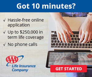
Compare that to the targeted life insurance ads below. In these ads, the deliberate imagery and messaging appeal to specific target audiences as opposed to the general public.


In general, users who are not yet familiar with a brand will probably respond better to content that builds credibility than content that tries to make them an offer. And, as we learned, 54% of consumers don’t trust ads. By incorporating verifiable social proof, testimonials, or awards into your ads, you can start earning trust even before somebody interacts with your brand.
Consider your venue
Determine your strategy by the format and location in which the ad is being seen. People are in a different mindset when they’re researching something on a site versus mindlessly scrolling through a feed. This is especially important when it comes to different types of social media. On Facebook and Twitter, people are looking at images and text posts. On LinkedIn, people are paying more attention to the text. But on Instagram, users are purely looking at pictures—so visually appealing elements are essential to grabbing people’s attention.
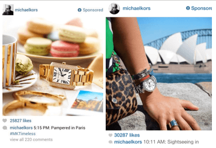
Use the “three R” strategy to stand out from the crowd: When deciding which picture to use, choose a real picture of real things taken by real people. Michael Kors used this strategy, and it resulted in a 370% increase in new followers.
Google’s Three C formula for capturing attention: be compelling, be concise, and be clear
When Google designers make ads, they use these three key principles. By doing so, the Google Media Lab found that the banner creative for its Android Wear campaign increased brand recall and intent by 15.8% and 9.4%, respectively.
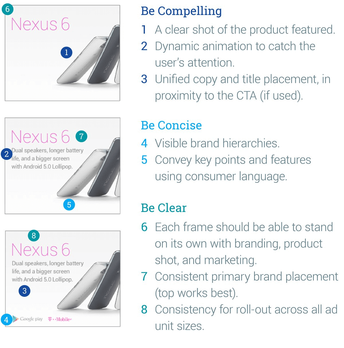
1. Be compelling
Effective display ads must be so eye-catching that they stand out from the noise. Animation, faces, colors, brand personality, and simple copy help distinguish ads. However, you should avoid going overboard with these elements—ads that incorporate too many of these features are intrusive and annoying.
There’s a great analogy my creative director, Bart, uses. Think of an ad like a house. You’re not putting all your living room furniture on the front lawn for everyone to see; you’re letting people knock on the door and peek through the window—and once they’re inside, they can see everything that’s in there.
You’re not trying to close the sale; you’re trying to get them in the door. The goal of the ad is to get the click. Leave it to the landing page to do the convincing.
2. Be concise
At any given moment, someone may glance at your ad. And at that moment, you have to make sure your message sticks. By being concise, you get the message across in the small window you have before a prospect loses interest or gets distracted.
You have to think of an ad like a highway billboard: Your audience concentrates on a site’s content—the highway. They need to process your message in the split second they take their eyes off the road. This means your message needs to be both impactful and easy to process.
According to a study by the ad agency BBDO, you have less than three seconds to convince someone to click your ad. And that’s being generous. Keep your copy between five and ten words—the average person reads five words per second. If you have an ad that’s 15 words, that takes up the three seconds you have. The viewer doesn’t have the time to process anything more before moving on.
Always remember: Less is more, especially when it comes to advertising. Say fewer words with larger text. Text that’s too small, boring, or misleading will bury your ad and annoy your audience.
Consider this ad:

The ad is following the display ads best practices we’ve outlined so far by having a concise message that tells the user exactly what they’ll get if they click-through and by being compelling through the use of bright colors on a dark background, making the message stand out easily.
3. Be clear
Most of the time, your ad’s only going to get a momentary glance. This doesn’t give you the opportunity to do anything more than pique someone’s interest and get them to click through. You can’t waste time.
To write a clear ad, ask yourself these two simple questions:
- What is the purpose of my ad?
- What is the message my ad is trying to convey?
Headlines don’t have to be complicated. In fact, they shouldn’t be. It’s okay to be straightforward with what you’re giving away. To go along with the house metaphor, here’s an ad for Marvin Windows:

This is a complete mess. Talk about too much going on… They’re asking, “Do you need new windows or doors?” while also telling you to turn to the local experts. Then there’s a second brand logo at the bottom. Plus, there’s teeny tiny text you can’t read unless you whip out your trusty ad microscope.
Communicating a single message about a single product is critical. Anything more will end up looking cluttered, requiring more effort to read. At the least, viewers will be confused. At the worst, they will be annoyed and never click through. Focus on getting the click with the Three Cs. You never get a second chance to make a first “impression.”
Compare that ad to this one by a competitor:

“Contemporary Made Easy.” Simple. I get it immediately. If I’m somebody who aligns with the contemporary style, I may think, “Oh, contemporary can seem hard. If they make it easy, why not?”
Everyone knows the phrase, “Keep it simple, stupid.” But I’m not a fan of calling anyone stupid, so let’s flip that script. How about, “Keep it stupid simple?”

So, how can we write captivating ads?
Capture and hold more attention with these 8 writing tips
1. Establish credibility
To build a positive brand reputation, use social proof through testimonials, awards and recognition, media mentions, and social media reviews. Fair warning, though: it’s hard to add credibility to web display advertising (but certainly possible).
As an example, Grammarly changed the text in an ad from “99% of Students Get Better Grades Using This Grammar App” to “99% of Students Surveyed Report Getting Better Grades With This Writing App.”
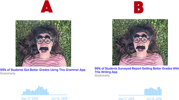
The phrase “…surveyed report” adds authority because it implies a data-driven approach rather than an unsupported, untrustworthy claim. It gives context to the “99%” number, even if it doesn’t mention the specifics of the survey.
Grammarly made an even more subtle (but equally important) adjustment by changing “Grammar App” to “Writing App.” This better aligns the language of the ad with the brand’s primary audience: anyone writing anything.
People are more skeptical than ever of advertising claims. Use a “don’t say it, prove it” mentality. The following ad copy from Promise, makers of vegetable spread, implies that users can verify the claim, either by clicking through to the landing page or searching independently.
Spread Endorsed by Cardiologists. And Taste Buds.
2. Be prospect focused
Prospects want to hear how your product or service relates to them and addresses their needs. When you can tell someone what you can do for them instead of just listing the generic features of your product, they’ll be much more inclined to listen. If you only talk about yourself and lead with “our” or “we,” it comes off as arrogant, not helpful.
3. Write emotional copy
There are six basic emotions: anger, disgust, fear, happiness, sadness, and surprise. All of these compel people to act. Look at the example below; this is a control variation as part of a test. It’s factual and generic, so it doesn’t play into any emotion.

Here’s the new version targeting a male audience. It’s not the prettiest ad, but that’s the point. According to Wordstream, the ad yielded a 47% higher click-through rate because people found it funny and controversial. Remember, we engage emotionally and biologically.

You may be wondering if it’s such a good idea to make your audience feel fat. The short answer? Yes. There are two basic types of effective ads: aspirational (“I want to be that”) and demotivational (“I don’t want to be that”). This ad is effective because it is the latter.
In Bud Light’s Dilly Dilly commercials, they aren’t selling the taste of the beer (because we all know it sucks).
They’re selling the experience you have while drinking the beer—that sense of community and fun times.
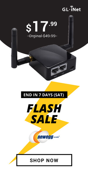
4. Create a sense of urgency
People generally put off making decisions until the last minute, even when they’re interested in a product or service. By creating a sense of urgency, you prioritize the need for your product in prospects’ minds and get them to act. Use concepts that create scarcity, like limited time remaining (but use a reasonable amount of time—anything less than 24 hours may seem spammy), early bird specials, and disaster aversion.
5. Use questions (and answers)
Ask a burning question that gets a prospect thinking briefly about an answer and helps keep their attention for a little longer. Just make sure the questions you present are open-ended and can’t be answered with a simple yes or no. Otherwise, you may never grab their attention. And if you must use a binary question, only do so when your audience is likeliest to answer the way you want them to.
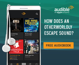
For the B2B industry, a headline like “Are you tired of slow SaaS implementations?” is going to align with the pain points of most prospects, and they’re likely going to answer yes. And of course, you can also answer your own questions.
Here are some examples of good questions used in ads from Apryl Duncan:
How do you redesign the most beloved small SUV? Very carefully.
Print ad for: Subaru Forester
What will you keepsake?
Print ad for: Hallmark
Why use fake flavors and additives when you can use lemongrass and coconut?
Print ad for: Kashi
6. Show the benefits
There are two ways to show the benefits of a product. First, you can explain the benefits to the customer by saying something like “Lose the beer belly with this pill.”
Or you can highlight a benefit you have over your competitors. Check out this ad copy:
Valvoline SynPower Offers 4X Better Wear Protection Than Mobil 1
Print ad for: Valvoline
Can you guess why what Valvoline says here about its motor oil isn’t technically a benefit?
It’s an advantage, not a benefit. To get to the actual benefit, you need to keep asking “so what?” until you hit a dead end. In this case, it doesn’t take long to figure out the benefit. Advantage: It gives four times better wear protection. So, what? Well, it’ll help you save money because your engine lives longer. Great, let’s put that into the headline—that’s the benefit.
“Valvoline SynPower: Double the Mileage and Half the Cost of Mobil 1.” Now, the ad’s talking about you. This is your car. And the product is giving you a longer engine life. Always make sure the benefit aligns with pain points the audience has, or else it will fall on deaf ears.
7. Use writing formulas
You can use simple writing formulas to help you write good headlines. There are plenty of techniques available online; we’ll discuss a few here.
One way is to use a “how to” structure in your headline. People love learning something useful for free. Instead of “Quitting Smoking is Hard,” which is factual and boring, you can say “How to Stop Smoking in 2 Weeks.” The reader now expects to learn how to quit smoking quickly.

“How to” statements don’t always have to be instructional; they can be creative. Here’s an example:
How to Destroy Canada’s Ancient Boreal Forest, in 3 Easy Steps.
Print ad for: Greenpeace
It’s clever, catches your attention, and makes you think. Here are two formulas you can use to create effective headlines:
- [End result they want] + [Time period] + [Address the objections]In practice:
Lose five pounds + in just two weeks + without starving
- [Take this action] + [Specific Time Period] + [End Result]
In practice:
Low impact exercise (for) + just ten minutes a day + means firmer abs
8. Edit, edit, edit
Keep editing your copy down to the minimum, understandable message. If you can say it in five words, how about three?
If you’re trying to convince someone to click on an ad with multiple talking points, you’re saying too much. Segment each point into different ads and test each one. Audience behavior will always tell you what resonates.
The 5-step process for testing ad copy that gets the clicks
So far, we’ve learned how people look at ads (or skip them entirely), as well as how to segment our audiences and consider our venues. We also looked at how to write headings that capture and hold a viewer’s attention. Now’s the time to get inspired, create our ads, and test, test, test. Here’s a simple five-step process you can use in every campaign to get a higher response.
1. Create a swipe file
A swipe file is a dedicated folder for screenshots of innovative or proven ads you come across in your industry. If you don’t have a swipe file, I highly recommend you start one now because you can grab ideas from industry giants and put them to good use. These corporations often have millions of dollars in budget and can test different ads faster and more effectively than your business can. By drawing on their experience, you can take the elements of banner ads that work and inject them into your ads.
Use websites like moat.com and adbeat.com to analyze competitor ads. Browse publications where your competitors buy traffic, and screenshot their ads. Don’t reinvent the wheel if you don’t have to. You can look at common, highly competitive direct-response markets (weight loss, relationships, beauty, finance) for more ideas, too—they constantly test and use compelling, concise language.
2. Jot down ideas
Then, start brainstorming ideas based on what you’ve collected in your swipe file. What emotions do the effective banner ads examples in your swipe file convey? Are they positive or negative? Start writing down ideas—not for headlines, but for the campaign. No matter how stupid, sketchy, or lame an idea may seem, write it down anyway because you only need to develop two or three great ideas. As the creative juices start flowing and you put more on paper, you’ll come up with better ideas.
3. Start writing ads
Shift your winning ideas into writing actual ad copy. Create a three-column spreadsheet. The columns can be labeled Headline, Body Copy, and Call to Action. Write 15 to 20 ads, one in each row, but plan to test only two to five of them. You may also find that sometimes you don’t need body copy and that’s okay! As long as your headline gets the message across, you can negate additional copy.
It seems excessive, but if you only write a couple ads, it’s unlikely they’ll be your best. No matter how amazing you are at copywriting, you need to warm up your writing muscles by writing so-so ads to dig toward the better ones.
4. Read each ad out loud
This next step is critical, but many of us, myself included, tend to skip it. Read each of your ads aloud. Make sure that the copy has rhythm and doesn’t sound confusing. There’s no better way to do this than to read it out loud. Ask yourself these three questions:
- What is my first impression of the ad?
- Am I being pulled smoothly through the copy?
- Does the copy roll off the tongue?
Good ads feel polished when read aloud, and bad ones feel unnatural and choppy. Cut the bad ones or massage them until they flow. Put that copy into a display ad and test the imagery. This also works well for animated ads because you can get a great sense of the timing. Plus, it helps ensure your copy isn’t too short or too long.
5. Rinse and repeat
Keep researching and writing new ideas. Your audience will tell you what works and what doesn’t. Repeat the entire process, reflect on what didn’t work, and gradually improve your ads. When you find ones that work, either improve the copy or keep the language and tweak the design a little.
Determine what incentives your target audience craves, and then test to see exactly how much of an incentive you need to offer to earn a conversion. Only A/B testing will reveal this sweet spot.
Real, effective banner ads examples
Can you guess which of these two ads by AdEspresso won?
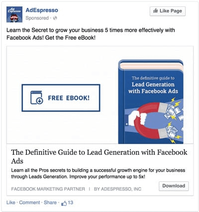
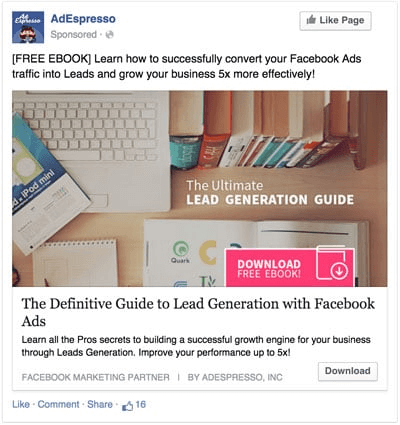
It was the left one because it’s so simple and explains what you get up front. People are mindlessly scrolling through their feed. They’re not paying close attention, and simple images and videos are what capture that attention quickly over more complex or overly clever ads.
If somebody stops and sees the prominent words “FREE EBOOK,” he or she will think, “Oh, okay. I get it.” The other ad has low contrast between the text, making it harder to read. Not only that, but the left one has a very clear button. Although the right ad’s button is pink, it blends into the background, is hidden in a corner, and is difficult to read. Prospects will most likely get frustrated trying to figure out the ad’s intent and keep scrolling.
Another important factor that contributes to the left ad’s success is its consistent coloring. By using shades of the brand’s blue, the ad creates a more compelling yet simple message. In contrast, the ad on the right is all over the place.
Let’s play another game quick game. Which ad best conveys the message?
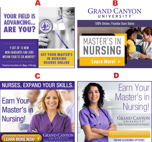
It’s B because the styling of the text “Masters in Nursing” is large, easily decipherable, and the first item you see. By squinting your eyes, you can test to see if the text is easily readable. Even though C and D use pictures, the photos still look like stock photos. People aren’t going to be moved by that imagery because they are not real photos taken by real people of people doing real things.
Now, which of these ads do you think performed the best?
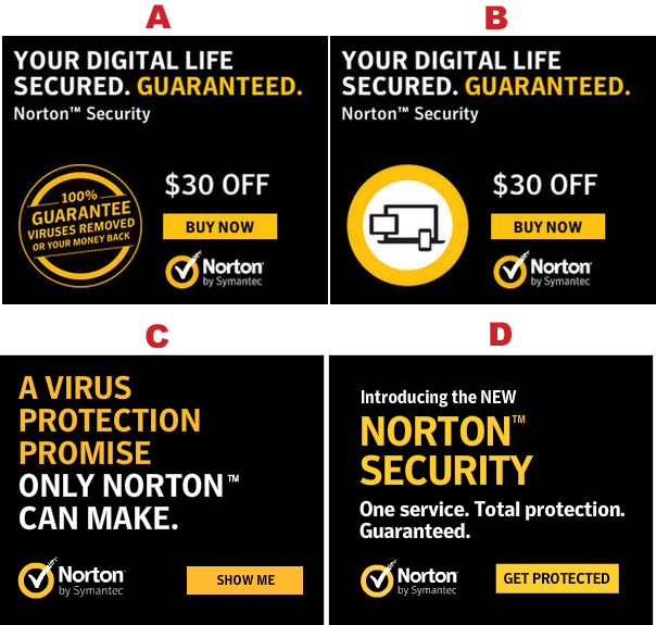
The performance winner was A. Why? It uses “you” at the beginning of the text: “Your digital life secured. Guaranteed.” The bottom two are talking about themselves. B was a close second to A. The A variation may have worked better because of its guarantee badge, which establishes credibility and risk reversal.
It’s important to understand that in digital marketing, what you think doesn’t matter. The audience always tells us what wins. Even if you think you are close enough to the target audience to figure it out, go with what the data tells you because it’s often different from what you think should win. Data doesn’t lie. Don’t get too married to an ad you prefer. Divorce your perceptions and ego from your creative.
Once you find the winner, keep it, and split test other tweaks on it. Try a different background color or button. Adjust the language a bit (but not too much).
You can also pull successful copy from your paid search campaigns. A breast cancer screening company tried to increase response on its Google ad. Initially, the copy focused on a feel-good benefit. It said, “Early Detection Saves Lives.” It’s simple but just generic and factual.
When they tweaked the ad copy to “With Early Detection, Survival Rate is 100%,” it became more compelling but stayed positive, and they only saw a small uplift in response.
Next, the company thought about its audience and figured they’re likely women with kids, a job, and responsibilities. They knew it was best to capture prospects in the act of researching breast cancer symptoms and took a more risk-averse approach. They changed the copy to: “Only 15% of Women Live 5+ Years with Late Detection.”
It’s not pretty; it sucks to read. But it worked. This ad delivered a 125% lift in appointments and 170% lift in phone calls compared to the feel-good ad. Even though something isn’t pleasant to write, it can align with the audience’s needs, especially when they’re already worried about their health.
Here is an example of an ad that has millions of impressions and puts into practice the banner ad design best practices that we mentioned:
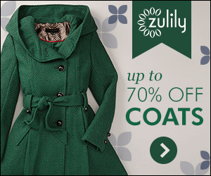
They didn’t just randomly pick a jacket to put on their creative. They probably tested a few different items and discovered that a green jacket is what leads to the highest CTR and sales. The bright green coat against the grey background catches your eye. Plus, it’s a pleasing shade of green.
Check out the short copy on the right—it’s brief but to the point. Using “up to 70% off” is more effective than saying something generic like “huge discounts” or “great deals.” Specificity and numbers are powerful in ad copy.
There’s a call to action icon in the bottom right-hand corner. The green arrow isn’t prominently called out, but it does make you want to click it. Zulily could have added text or made it stand out a bit more, but this seems to work for them.
The creative contains their logo with a bit of branding at the top. It doesn’t catch your eye, which is good because it doesn’t take away from what should catch your eye. You’re likelier to notice it once you get into the copy.
Wrapping it all up
Remember, banner blindness is everywhere. We see hundreds or thousands of ads in just one day. Overloaded by all that information, we learn where ads are located and instinctively ignore them.
As I demonstrated earlier, even elements that look like (but aren’t) ads can poison content around them and get avoided. If something looks like an ad, we usually won’t give it a second thought. Even with these obstacles, you can grab more attention by adding a personal touch with hyper-segmented audiences combined with thoughtful copy and imagery.
Great writing is the key to creating effective display ads that win the click. When you only have a second to convince someone to click, remember to keep it short and focus on just one talking point. Trim the message down to its simplest form—leave it up to the landing page to close the sale.
Finally, keep testing. If you don’t test, you won’t uncover the cream of the (ad) crop. Your users will tell you what’s working and what’s not with their click-through rates.
Now, go forth and win those clicks!

What was the most useful tip you learned from this article? Let me know!
Grab a free E-Book version of this article to access at any time!
Read about the 8 benefits of singular negatives in Google Ads
View all posts filed under “UX & Design”
Most newsletters suck...
So while we technically have to call this a daily newsletter so people know what it is, it's anything but.
You won't find any 'industry standards' or 'guru best practices' here - only the real stuff that actually moves the needle.
