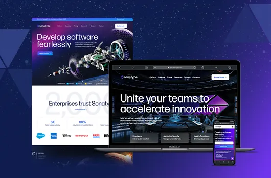
Sonatype
Learn moreHow CARET Legal’s SEO exploded post-redesign
Learn more
Website-in-a-box makes migration seamless
Learn more
How an online university doubled their new student inquiries with AI-driven SEO
Learn more
How an association elevated engagement with a web redesign
Learn more
How this debt relief company scaled their paid social ads by 1,000%
Learn moreHard work delivers results.
See Our Awards
We're hiring
Find your next role in marketing, creative, development, or operations.

Capabilities
We apply the full breadth of our experience to every challenge.