Google’s Mobile Website Rankings Update: What Higher Ed MarCom Professionals Need to Know
Google is releasing a major search engine update on April 21st that penalizes websites not offering a mobile-friendly experience. The penalty lowersa site’s positionin mobile search results if the sitesuffersfrom small font sizes, links/buttons that aren’t touch-friendly, and other usability problems.
For anyone in the higher education industry, this penalty is particularly troubling — 71% of prospective students and 45% of their parents lookat a school’s website on mobile devices during the search process. So if your institution’s website isn’t mobile-friendly, prospective students aregoing to struggle to find it in Google’s mobile search engine results.
What this post covers:
- Explanation of Google’s Mobile Usability Update
- How to Prepare Your Website
- How to Fix Your Mobile Usability Problems
- How to Stay Ahead of Future Google Updates
What Will The Algorithm Update Affect?
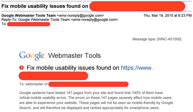
Simply put, if your school’s website isn’t mobile-friendly, it isn’t mobilemarketing ready.And to Google, that means your siteshouldn’t show up inmobile search results. In fact, your institution’s webmaster should have received emails from Google warning you if your website was not in compliance with Google’s new standards.
Specifically, this update analyzes your website on a page-by-page basis. So if 75% of your website is already mobile-friendly, then only the other 25% that is not mobile-friendly would be affected. But there is an exception to that statement: there are a myriad of other factors related to mobile that Google considers and they may also affect your school’s indexing and ranking.
Another consideration is that Google’s new search update analyzes results in real-time. This means that if your web pages were not mobile-friendly when Google’s update first went live then any mobile usability fixes afterwards would almost immediately be registered by Google. In the past, some updates, like Penguin, were performed periodically so you had to wait until the update was re-run to regain your rankings.
Why Is This Mobile-First Push Different?
Your Marketing and Communications Department hardly needs another reminder about the mobile-first mentality of prospective students. Industry reports, internal statistics, and just about every digital marketing guru has been beating that drum since the first iPhone debuted.
But this mobile prophecy is different. Google is making the claim and they plan on backing up their words with some serious action. And this time, there’s a firm deadline — April 21st, 2015.
Google’s big push for mobile can easily be understood by looking at one piece of data: the majority of people are using mobile devices to perform searches. For Google, we’ve finally reached the tipping point where “mobile-first” actually matters.
This isn’t the first mobile-oriented search engine update by Google, however. There have been plenty in the past, but the size and scope of the April 21st update is massive compared to previous updates (and other search engine updates in general).
How To Prepare for Google’s Mobile Usability Changes
Google’s new search engine update offers higher education Marketing & Communications teams a reallygoodreason to dig into their mobile marketing plan. Your school’s website will undoubtedly need to be updated at some point to accommodate for the growing number of mobile users, so this is a great chance to start exploring the opportunities.
So if your website isn’t mobile-friendly and you want to know what you should do, follow the steps below to (a) figure out how compelling your need isand (b) know where you can get started.
Step 1: Determine Your School’s Need
A mobile-friendly website is important for any organization (and doubly so for anyone in the higher education industry). But there are plenty of other needs that are of equal or greater importance — site speed, CRM integration, content relevance, etc. So before you make a big push for mobile-first, you need to assess whether it makes sense withyour organization’s marketing budget (described in step 2).
Don’t let Google (or anybody else) scare you into unnecessary website updates. Admittedly, the odds are against you not needing invest in amobile marketing plan, but you should still do your due diligence and quantify how important mobile traffic is for your higher ed institution.
Step 2: Assess Your School’s Website
You probably already know this, but I’ll say it anyway: the best way to proveyour school’s need for mobile-friendly website design is by digging into your data and looking at your existing web traffic. If your anticipated gains (i.e. more mobile conversions) and/or losses (i.e. less mobile traffic) are greater than the cost of making your website mobile-friendly, then you should build a mobile version of your website.
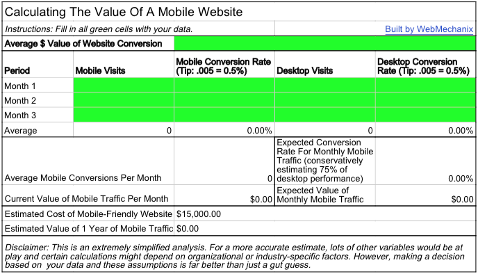
Here’s our simplified formula for figuring out how important mobile is for your website:
- Determine average number of visitors & conversion rate on mobile devices
- E.g. 1000 unique visitors/month & 0.5% conversion rate = 5 conversions/month
- Determine average number of visitors & conversion rate on desktop devices
- E.g. 9000 unique visitors/month & 2.0% conversion rate = 180 conversions/month
- Calculate expected gains from a mobile optimized website
- E.g. 1000 unique visitors/month & 1.5% conversion rate (estimating 75% of desktop performance) = 15 conversions
- Balance the cost of making your website mobile-friendly with your anticipated gains/losses
- E.g. ~$15,000 making website mobile-friendly < $ value of 15 conversions/month
If you want to calculate the value of a mobile-friendly website with your own data, you can use our spreadsheet calculator to get a rough estimate of your mobile traffic’s value.
Also, note that your mobile visits referred from Google likely to go down to almost 0 after April 21st if you do not have a mobile-friendly website. So, making your website is mobile-friendly can not only increase visits and improve your conversion rate, it will also prevent you from losing conversions. So you don’t forgetto factor that loss into your calculations as well!
Step 3: Review Mobile Usability Solutions
If your school’s website data convinced you about the importance of becoming mobile-friendly, then you need to weigh your options. Responsive websites are the most popular approach (for numerous reasons) but they don’t make sense in every circumstance.
You can read previous blog entry discussing the merits of a responsive website versus other alternatives, but I’ll summarize your options here:
| Responsive Design(Explanation) | Dynamic Serving | Dedicated Site |
Pros
Cons
|
Pros
Cons
|
Pros
Cons
|
For what it’s worth, Google suggests using a responsive website design. Again, that doesn’t mean it’s your best option, but for most websites it probably is. It’s more future-proof and more Google-friendly than the other options (for the most part). Plus, you Marketing & Communications team shouldn’t have to worry about revisiting this process 1-2 years down the line.
How to Fix Your Mobile Usability Problems
A mobile-friendly website design should take care of most usability problems, but it’s not guaranteed. Mobile usability standards for humans and Google are slightly different. While your website may appear usable to you and your design team, Google may find problems that went undetectedby human standards. So, how can you be sure your website won’t be penalized?
First, Pinpoint Problem Areas
Google’s mobile usability update operates on a page-by-page basis. You can see a list of your problematic pages in Webmaster Tools Mobile-Usability Report. This is the quickest, most sure-fire way to find out what you need to fix.
If you don’t have access to Webmaster Tools reports, there are other methods for manually checking your school’s webpages. Google, not surprisingly, offers a standalone mobile-friendly URL tester that will tell you if the page meets Google’s standards. You can also test your URLs with W3C’s mobileOK Checker, which provides a more technical analysis of the page’s mobile usability.
Next, Quickly Fix Your Most Important Pages
Finding and fixing these problems manually may take a lot of time, so you’d do well to prioritize pages based on existing traffic levels. Google Analytics is a great resource for this information. You can easily run a report that compares desktop traffic with mobile traffic to locate your biggest mobile usability problems.
If your most popular desktop pages aren’t getting muchmobile traffic, you should start there. That’ll ensure your website’s performance doesn’t completely deteriorate. Next, you should identify the pages you place the most importance on (regardless of existing traffic levels). Fixing their usability problems and sprinkling in additional content (copy, pictures, etc.) can go a very long way to improving the page’s performance in search engines.
It almost goes without saying, but this is just the start (and extremely simplified)for amobile marketing plan for a higher education institution.Showing up in search engine results is the bare minimum and you’re going toneed tobe continuouslybuildinga user-centricexperiencefromhere. Today, that means making mobile usabilityaccommodations for the mobile-first mentality of prospective students.
Staying Ahead of Future Google Updates
Google’s search engine updates often catch people off-guard. This tends to happen because of Google’s transparency problems, which are twofold: 1) Fully divulging every detail for each update would help spammers manipulate Google’s search algorithm, and 2) Google’s public relations/content teams are pretty terrible.
Despite a lack of clear direction from Google, you can follow one basic rule and almost guarantee your site will rank highly in any type of search engine results: give your audience exactly what they want. The first tenet of Google’s company philosophy lends support to this idea, stating, “Focus on the user and all else will follow.” As long as Google sees you doing that, you’re good in their books.
So what does this mean your school should be doing? It means you should be constantly examining website analytics reports to figure out what’s working best for your users and where you can improve.
The most effective way to do this is by identifying your website’s ultimate purpose (e.g. setting appointments, selling widgets, etc.) and working your way backwards through the process — how did your best visitors get there and what are the biggest obstacles preventing everyone else from completing the site’s main goal?
Whether you’re managing a web vendor or doing optimizing your site in house, you need to make it clear that everyone’s ultimate directive is to make life better for your audience. If you’re doing that — instead you’re trying to follow the latest trends that immediately provide unbelievable results– then you probably already have mobile-friendly pages for your users and you have nothing to fear from Google. But if you don’t, that’s okay. Because you’ll have a mobile site soon (or else, says Google).
To take this even further, you can start incorporating general usability solutions and strategies into your school’s digital marketing plan. We offer a low-cost usability report thats a good first step for this kind of work. It provides you with high-impact suggestions that are easy to implement and are all based on observed visitor behavior. You can learn more about that here.

Most newsletters suck...
So while we technically have to call this a daily newsletter so people know what it is, it's anything but.
You won't find any 'industry standards' or 'guru best practices' here - only the real stuff that actually moves the needle.


